You don’t have to be a Photoshop wiz to be a graphics master and produce content for your business. You can take advantage of modern technology and not-so-sophisticated tools on the internet to produce impeccable graphics for your business, especially when it comes to a largely popular social website like Pinterest.
If you’ve ever used the platform to pin your favorite ideas, you know that visuals are the key to Pinterest marketing. To help you get started, here’s a guide on developing captivating graphics for Pinterest.
Table of Contents
ToggleBest Practices for Creating Graphics for Pinterest Image 2024
Creating video pins and image pins is an effective tool to market your business, whether you’re running an online store or a commission-based business where you deliver custom-made products to niche clients.
Pinterest has over 470 million monthly active users worldwide, so it’s easy to see how creating graphics for Pinterest to represent your business can help you reach a wide target audience.
Social media platforms offer immense potential in driving a marketing strategy in this day and age. Here’s a list of the most useful tips and advice that you can use to create Pinterest graphic pins.
Create an Attractive Image
On Pinterest, images need to be both visually and informatively attractive. If you’ve noticed that a particular trend is capturing users’ attention on Pinterest, try to blend in. For this type of marketing to be effective, you have to become a part of the trend so that users are drawn to your content.
Of course, you still need to stand out so users remember who you are, and for that, use an editing tone that reflects your business’s brand. Similarly, incorporating proper keywords and an optimized description using language that your followers can understand easily. Next, ensure a proper layout and image aspect ratio.
Users tend to pin and re-pin images after seeing them through different blog posts. Your goal is to have your graphics among those that are saved and added to wish lists, but to do that; you have to create attractive images that people want to use.
Make Sure It’s The Right Size
On Pinterest, the ideal aspect ratio is set as 2:3. All the blog pins on Pinterest are portrait-oriented (vertical pin), which we will discuss below. Vertical pins have a standard image dimension of 735 pixels x 1102 pixels. Similarly, any standard square pin on Pinterest is 1000 pixels x 1000 pixels, with an aspect ratio of 1:1.
Create Vertical Pins
Vertical pins (portrait-oriented) are the most popular on Pinterest because of how snugly they can fit on mobile device screens. Vertical pins on Pinterest have an aspect ratio of 2:3, and the optimal dimensions for a vertical graphic pin are somewhere around 735 pixels x 1102 pixels.
You will encounter width restrictions, such as 238 pixels for a pin in a blog. But, this also means that you can post longer images and video pins on Pinterest. As for Pinterest board cover photos, they should be no more or less than 600 pixels x 600 pixels.
Add Some Text To Make Pins Informative

This is a plus for viewers facing visual impairment, which prevents them from fully accessing the visual pins on Pinterest. By adding alternative text to your blog images on Pinterest, you can make them more accessible and useful for pinners. They can easily learn what the pins are about, whether they’re video or image pins.
Similarly, adding text inside the images is another great marketing strategy. Using visuals such as colors, objects, and an engaging tone, you can help the text highlight what the blog pin is about.
Brand Your Images
It’s important that you use your Pinterest pin collections, including videos and images, to showcase what your brand is about. When you optimize your pins according to SEO and write reader-friendly descriptions, you create an impression of your brand for your viewers.
The best approach you can take is to try something new and unique for every blog pin you create. This way, you stay ahead of your competitors and deliver content that your audience is looking for. Of course, make sure that you don’t go overboard with the pin size.
You can add exclusive tags to your pins, ensuring that they’re specific to your business and niche, as well as what you’re showing in a particular blog post. You can insert SEO-optimized alt text in your images to attract the right audience.
After all, your end goal is for your target audience to see your pins and save them to their wish lists.
Use Warm Colors

Images can induce certain emotions by using specific colors that can have a psychological effect. Warm colors tend to induce feelings of optimism and happiness. They primarily include yellow, orange, and red.
Most commonly referred to as comforting colors, you’re likely to see them on a majority of pins with tags like “positivity” and “happiness.”
You can use warm colors to create an eye-catching pin and post it as a social media image on any platform where you have an audience. Similarly, if you’re listing a blog post through your Pinterest pin, make sure the color scheme is relevant to the content.
Pair Your Image With Fantastic Fonts
For your pins to have their desired effect on the audience, you need to choose a great font for the text. Some of the most beautiful font pairings include PT Serif and Century Gothic, Courier New and Montserrat, and Lucida and Lucida Sans.
You can come up with various font pairings to create attractive blog graphic pins for Pinterest.
The best suggestions for text overlays are as follows:
- Sans Serif font with Serif font
- Script font with sans Serif font
- Serif font with a handwritten font
- Helvetica Now font with Helvetica font
Don’t Add Faces
Ever wonder why you don’t see a lot of faces on businesses’ Pinterest accounts? Here’s why: When Pinterest users look at pins about recreational activities and lifestyle trends, they tend to visualize themselves in the pins.
Seeing someone else in the pins, especially clothing pins, makes it difficult for the user to visualize themself in the image.
So for a blog post, select an image that features the back of the head. Or pick cropped images that only show people up to their necks. Not to mention, your pin design and pin graphic should be complacent with the idea that you are promoting. This will ultimately help you drive more Pinterest blog traffic.
Avoid Adding Borders
Considering that Pinterest is a primarily visual platform, you have limits on image sizes. Since you’re restricted to a fixed number of pixels, avoid using borders when designing pins. If you’re looking to create a potentially viral pin, focus on making it appealing and keeping it easy to visualize.
Borders and alterations can hide the key elements of an image, or worse, the entire image. Remember, the entire concept of making an engaging Pinterest pin is, so viewers visualize themselves in it. When there are distractions like borders in the image, you risk not connecting with the audience.
Use Organic Shapes in Your Graphics

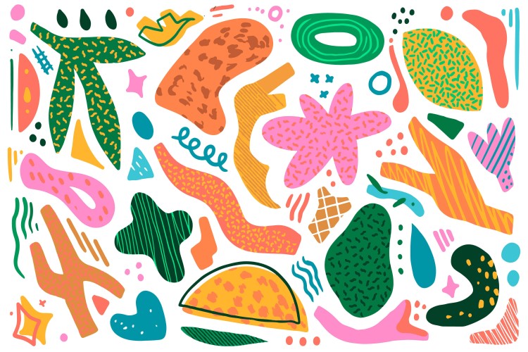
To create engaging graphics, you also need to make sure that they’re uncomplicated. This means adding organic shapes that instill a sense of calm within the audience.
A lot of business profiles on Pinterest include organic shapes like irregular polygons and asymmetrical shapes in their pins because free-flowing shapes that naturally come together make graphics more appealing to viewers.
Since they’re asymmetrical, it allows you to express a natural object that you’re trying to emulate through a Pinterest image.
For instance, if you’re a sustainability-focused brand, incorporating natural elements like leaves and flowers in your pin design and pin graphics can capture viewers’ attention.
Use Mock-Ups for a User’s POV
To see things from the audience’s perspective, look at mock-ups of your graphics. These are samples of how your pin will show up if a user clicks on it.
Now as yourself: would they find it easy to access and use? Is it relatable? Can the viewers access the associated links that you have inserted into your Pinterest graphic image pin? It’s all about creating a customizable visual template that your viewers can use to access your pins.
Since you are on a social media graphic platform, a mock-up can help you determine which template will look best on your Pinterest.
After all, that’s the goal of a Pinterest strategy and marketing plan. Using the right template can let your viewers see how you use the right SEO keywords, optimize the description, use a good font pairing style, and apply warm colors.
Various online Pinterest graphic image-creation and graphic design tools, like Canva Pro, are available online, and you can access them for free.
Don’t Compromise on High Resolution
Circling back to what we mentioned earlier about image size, here’s a brief overview of the file image size recommendations for each category that Pinterest has laid out. By reviewing the image size recommendations, you’ll know how to set up your business profile on Pinterest.
Keep in mind that the general guidelines and other requirements pertaining to image and video pins on social media platforms are different. This is similar to Facebook and other social media websites.
| Image Type | Recommended Size |
| Board Cover Image | 200×200 |
| Pin Image | 600×600/600×900 |
| Profile Picture | 400×400 |
You should upload high-resolution photos, and by that, we mean high-quality and sharp images that are visually appealing to viewers. In all cases, whether you are going for standard image sizes or high-resolution photos, make sure to post a content-rich pin.
Create a Template
To develop a Pinterest marketing strategy that represents your brand on the platform, you must create templates that make your brand recognizable. You don’t necessarily have to craft your own Pinterest graphic template for this.
Even if you pick an available template, the important aspect is to show them as your own. Creating the most “pin-worthy” templates is your goal, and by doing so, you can drive more traffic per post.
Pinterest offers an incredibly powerful digital app that you can use according to your business needs to address the requirements of potential viewers, users, and customers.
Your template should have a great font and color palette pairing so that it’s appealing to the eyes. Don’t forget about the text size that you incorporate into your Pinterest template. General templates can help you save time by using pre-made graphics and changing them according to the visuals that you wish to post.
Best Practices for Creating Graphics for Pinterest Video
If you thought that images were the only aspect of Pinterest marketing, you’re wrong. Say hello to video pins. These share some similarities with the reels and stories model that you’ll see on many social media platforms these days. These are great ways for creators to record creative videos and edit them.
Containing up to twenty pages of content, they require the use of tools like transitions, background music, and voiceover recording.
After all, if you’re a food-based business looking to promote a recipe or cutting techniques on Pinterest: an image won’t suffice. So posting impressive video pins can attract a lot of viewers to your Pinterest profile, but what makes an impressive video pin? Here’s what.
Create a Compelling Pinterest Video Pin

By compelling, the basic idea is to use thumbnails that reflect the entire concept of the video pin in just one picture. This is extremely helpful because the more you summarize your content in one picture, the more viewers will explore your pin collections.
Try to stick with the trend. For instance, if you post about recipes and cooking styles, you can try something that correlates with the season. Also, you can perform SEO research to see which recipes and cooking styles are trending.
Choose the Right Size and Duration for your Video Pin
There are two sizes for video pins: square and vertical pins. Square video pins, like images, feature a 1:1 aspect ratio, while vertical video pins feature a 2:3 (9:16) aspect ratio. The minimum recommended length for posting Pinterest video pins is 4 seconds, while the maximum is 15 minutes for a long pin.
You may think that finding the right blend of size and duration is difficult. However, it depends on the content that you are sharing.
Design an Attention-Grabbing Cover Photo
While videos do capture more of the audience’s focus than images, it’s not enough. Your video pin needs a creative cover photo that includes attractive text fonts and images.
That’s the recipe for a cover image on popular Pinterest profiles that pique the audience’s interest. You can make creative cover photos using unique aspects of your Pinterest pin collection as well.
Use Creative Features with Editor for a Greater Impact
Don’t let your video pins slide into your posts once you upload the video content, and add the description along with alt texts. Try some of the editor tools to improve the quality and creativity of your video pins so they’re more attractive to viewers.
Use the First 3 Seconds to Hook Your Audience
The first three seconds are crucial. If you appear to deviate from the concept of the video pin it’s intended for, you risk losing the audience’s attention. Try to show unique visuals with a blend of text overlay to grab viewers’ attention.
For instance, if you show “how to cut fresh lettuce,” don’t start by asking, “are you here to learn the best cutting technique for fresh lettuce.” This will put off interested viewers and keep them from coming back to your Pinterest profile.
How about starting with something that will make them not want to leave? You could say, ‘have you been cutting your lettuce wrong all this time?”
Brand Your Video Pin
Don’t let your video pins get lost in the sea of Pinterest videos. You are your graphic designer, and building the brand starts with branding what you post. Therefore, use unique tags and alt texts to help viewers recognize you whenever they see your video pins and image pins.
Skip the Audio and Tell a Story Without it
Does your video pin lack audio? No problem. Luckily, you can use different editor tools to adjust the video and clip it according to your requirements. You can even insert text, but make sure that the text-to-video ratio isn’t high.
Facebook recommends no more than 20% text compared to image visuals. Lastly, creating a story pin can help you address the lack of audio in longer pins.
Add Text Overlay
It’s common for people not to have audio-listening devices, such as earphones or headphones, on them. Therefore, using text overlays is best. For example, if you share a vegetable cutting video pin, you can use text overlays like “cut here” and “start slicing from here” to help those lacking audio facilities.
You might be interested to check those related posts as well:
- Pinterest Pin Size: What Size Should Pinterest Images Be in 2024?
- How to Successfully Post on Pinterest in 2024 [7 Content Types]
- Video Pins on Pinterest [Detailed Guide 2024]
Conclusion
These were a few ideas and tips on creating beautiful pin collections and graphics for Pinterest. Take a few hints from these to cultivate a unique viewer base for all your business pins. Pinterest traffic can help your business get more referrals if you dedicate as much effort to it as you do to Facebook, Twitter, and YouTube strategies.


