“One can speak poetry just by arranging colors well.” –Vincent van Gogh
“I found I could say things with color and shapes that I couldn’t say any other way.” –Georgia O’Keefe
Ask any artist and they will tell you that the influence of color cannot be overstated. Color is powerful. It not only communicates ideas and information, but it has the ability to influence emotions and alter thinking.
Even more, color can trigger physiological responses in humans. In a 2015 study, it was found that yellow and red hues increased heart rates in the participants.
Color is an essential tool for artists and designers, but choosing the right color scheme for branding a business is also crucial in marketing. Colors send an immediate message to your customers about your business even before they read one product description or review. And we all know those first impressions last.
Color plays into a brand identity. What is your company about? You want colors that represent your business’s “personality.” Is your company playful? Serious? Eco-friendy? Edgy? Whatever it is that makes your business unique, the right colors can showcase it.
Whether you’re designing a logo or a website, implementing brand colors across your marketing materials also plays a key role in brand recognition. Think about the iconic green and yellow of John Deere. Everything from their tractors to their logo is emblazoned with the famous brand colors. You can recognize their products without reading a single word. That is powerful marketing.
Choosing the right colors to represent your brand is important, but it doesn’t have to be difficult or overwhelming. Read on to learn the basics of color theory and important points to consider when choosing your brand color palette.
Why do Colors Matter in Digital Marketing?
Colors impact customer engagement. They create a feeling in the website visitor that can last longer than the way other elements influence people.
With the right combination of colors, you can grab attention and keep it, encourage users to go through your sales funnel more easily, create brand awareness and returning visitors, and turn them into buyers. But the numbers speak for themselves.
According to research by QuickSprout, color is even referred to as the main reason for purchasing a product by 85% of online shoppers. To what extent it increases brand recognition and how important it is for people to find their favorite colors on your website is also surprising.
Great-written content and a professional-looking marketing blog aren’t enough anymore. These are just a few of the necessary elements for creating a successful brand and building a name for yourself.
Did you know that visuals get 94% more views than text?
That’s what you need to be focusing on more than ever, and colors are the first thing you should emphasize on.
Let’s talk a bit about the psychology behind this and how colors affect decisions in the digital world before we move onto the tips for finding the ideal color scheme for your website.
What is Color Theory?
Source: Stock.adobe.com
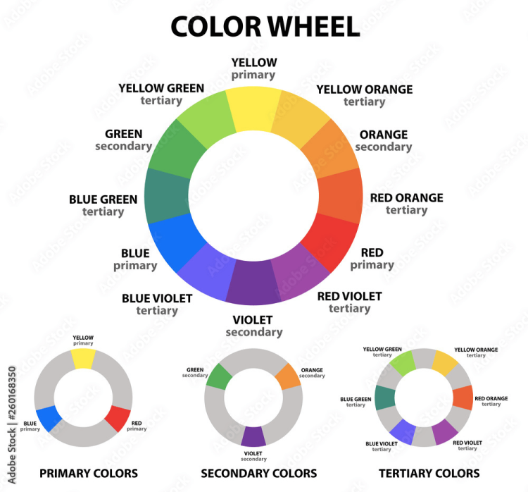
Most people learn the basics of color theory in elementary school. Young children know that the three primary colors, red, yellow, and blue, mix to create all other colors. Many adults have heard of the color wheel, secondary colors, and complementary colors.
Color theory is about color mixing and how various color combinations work together in harmony. Color theory and color psychology (read more on that below) work together to tell a story.
Designers regularly utilize color theory in marketing. Color combinations must be eye-catching and appealing to your audience. Because of this, it’s important to know your target audience. Gender, age, and culture all play into how colors and color combinations are perceived.
The Color Wheel and Complementary Colors
Source: Stock.adobe.com
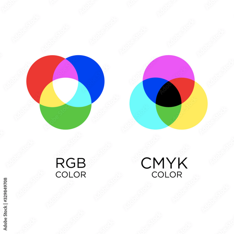
Like most things learned in primary school, color theory is a little more complex than red + yellow = orange. There are multiple models for mixing colors. The first is the RYB (red, yellow, blue) color wheel. This is the color wheel most people are familiar with. This color wheel is used by artists and has to do with mixing pigments such as paints or dyes.
A second model is the CMYK (cyan, magenta, yellow, and key – another name for black) color wheel. This type of color mixing is used for printing. The four colors of ink are used to mix all of the other colors.
A third model is the RGB (red, green, blue) color model. This has to do with how various colors on the light spectrum mix and how we perceive color. If you’ve ever been to a live theater performance, you may have noticed stage lights using colored filters. This is an example of mixing lights to achieve specific coloration.
The RGB color wheel is also used for any screen, such as televisions, tablets, or computers as the colors we perceive on the screens are made of light. It’s important to understand RGB when considering your digital marketing strategies and how colors will appear on screens.
Source: Stock.adobe.com
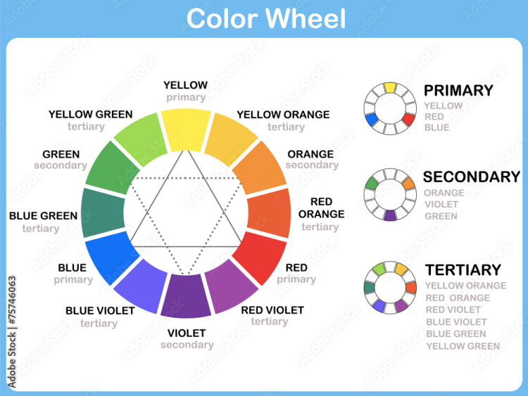
For simplicity, we will be referring to colors as they appear on the RYB color wheel. The RYB color wheel model gives us an easy and visual way to understand how colors relate to each other. The colors on the wheel can be organized into three groups:
- Primary colors: the colors that cannot be made from other colors and are used to mix every other color – red, yellow, blue
- Secondary colors: the colors created from mixing two primary colors – orange, green, and violet
- Tertiary colors: the colors created from mixing a secondary color with a primary color – yellow-green, blue-green, red-violet, blue-violet, yellow-orange, and red-orange
Source: Stock.adobe.com
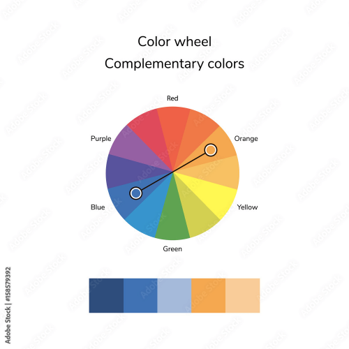
Colors across from one another on the color wheel are termed complementary pairs. These color combinations complement each other because together they offer the most contrast.
Source: Stock.adobe.com
These pairs include:
- Red and green
- Yellow and violet
- Blue and orange
- Yellow-green and red-violet
- Blue-violet and yellow-orange
- Red-orange and blue-green
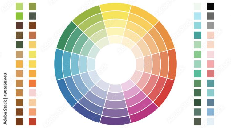
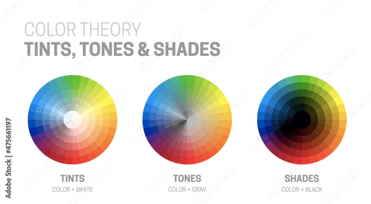
Additionally, some RYB color wheel models include varying saturation levels. Black, white, or grey can be added to any hue to create different saturation which can brighten or dull the colors. These colors are given their own terminology:
- Hue – the pure color
- Tint – the pure color with white added
- Shade – the pure color with black added
- Tone – the pure color with grey (black and white) added
Source: Stock.adobe.com
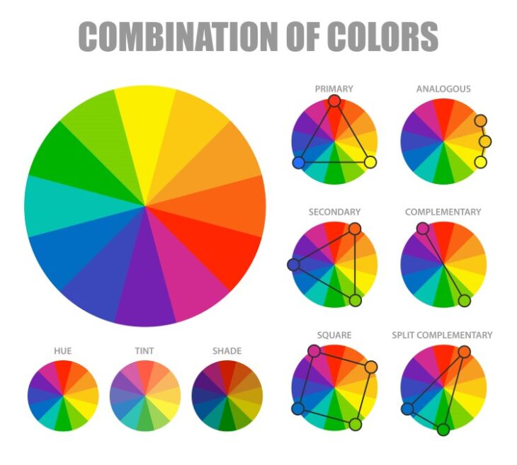
Types of Color Schemes
There are infinite ways to combine colors, but there are seven classic color schemes that are consistently used. Sometimes these schemes are referred to as “color harmonies” because when these colors are combined they are often aesthetically pleasing.
Analogous color scheme
Source: Stock.adobe.com
An analogous color scheme involves colors with similar properties. These colors are adjacent to one another on a color wheel. Analogous color schemes can often be found in nature. They are harmonious and can offer a sense of peace. Because of the lack of contrast, analogous colors create a softer design.
An analogous color scheme often utilizes three to five colors. Designs that employ a warm color palette (red, yellow, and orange) or a cool color palette (blue, green, and violet) are often analogous color schemes.
Complementary color scheme
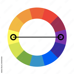
Source: Stock.adobe.com
Complementary color schemes use only two colors, but may be paired with black or white. They are bold and eye-catching because of the highly contrasting colors. Complementary pairs are the furthest separated on the color wheel, sitting directly across from one another.
Because of the high contrast, you need to use complementary colors carefully or your design may come off as garnish. To avoid this, use one main color and use the other as an accent color.
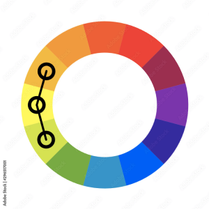
Split-complementary color scheme
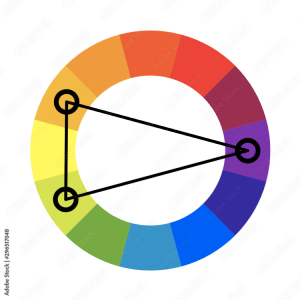
Source: Stock.adobe.com
Another high-contrast yet slightly more subtle color scheme is the split complementary color. To create this color scheme, select a base color and combine it with the two colors adjacent to the base color’s complement. For example, if your base color is blue, the split complements would be red-orange and yellow-orange.
Triadic color scheme
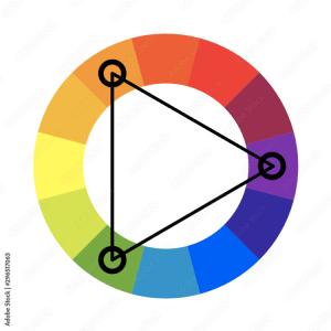
Source: Stock.adobe.com
The triadic color scheme is another high contrast and versatile color scheme. This scheme uses three colors evenly spaced around the color wheel, such as orange, green, and purple.
Triadic color schemes tend to be bright and vibrant, even when using less saturated colors, so it’s important to balance them by selecting one main color and using the other two as accents.
Tetradic color scheme
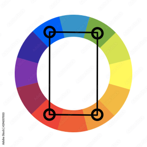
Source: Stock.adobe.com
The tetradic color scheme, sometimes called the “rectangle color scheme, uses two pairs of complementary colors. This color scheme is vibrant but when used incorrectly it can come across as aggressive or harsh.
To maximize this color scheme you really want to consider the emotional balance of colors. It works best with one main color and using the other three as accent colors.
Monochromatic color scheme
Source: Stock.adobe.com
“Monochromatic” means one color. To make a monochromatic color scheme you simply use varying shades, tints, or tones of a base color. This color scheme is low contrast but can offer a soft and subtle elegance to a design.
Square color scheme
Similar to a tetradic color scheme, the square color scheme uses four colors. The difference is the colors are not complementary pairs but spaced evenly around the color wheel. For a successful square color scheme, balance warm and cool colors.
One variation of this scheme uses the primary colors and green, creating a playful, yet potentially childish color scheme.
Examples of Color Palettes
What is the difference between a color scheme and a color palette? Color schemes, as mentioned above, are based on color theory. A color palette is comprised of the specific colors you use for your branding. Palettes are based on the chosen color scheme.
Of course, there are infinite options when choosing your color palette, but below are some popular palette styles.
Neutral color palettes – neutral colors are simply muted shades, sometimes to the point of appearing to lack color. Colors include grey, beige, taupe, and cream, but may also be paired with darker colors, such as black, brown, and navy.
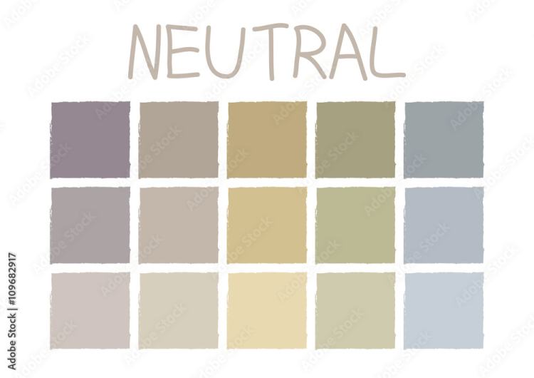
Source: Stock.adobe.com
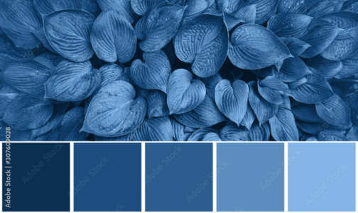
Natural color palettes – natural color palettes are inspired by nature, whether that be a coastline, sunset, or forest. Oftentimes these palettes include earthy browns or greens. Nearly any color can be found in nature, so it’s simply a matter of finding the right tones.
Source: Stock.adobe.com
Bright color palettes – bright colors are just that – bright! They offer eye-catching, punchy colors that can feel playful and fun. You have to be careful because if the design is too bright it can come across as gaudy or clownish.
Source: Stock.adobe.com
Pastel color palettes – these colors are usually tints. Mixing white into the pure hues softens and subdues the colors. These colors are thought to be more feminine and are often associated with springtime or weddings.
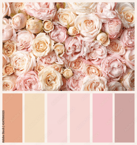
Source: Stock.adobe.com
Retro color palettes – these colors are used to make something feel old or vintage. They tend to be more muted tones paired with neutral colors.
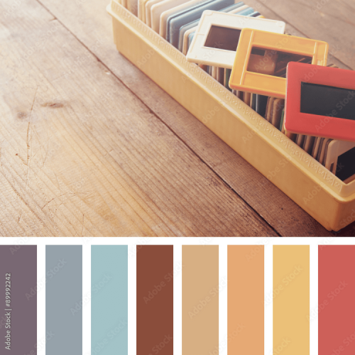
Source: Stock.adobe.com
Color Psychology in Marketing and Branding
It is well known that colors psychologically affect our moods and emotions. Artists use color to convey feelings in their artwork. Interior designers consider color when decorating rooms to evoke a specific atmosphere. And marketers must consider color when branding their business for the same reason: color makes us feel.
Color psychology and color theory are closely related. While color theory focuses on color mixing and harmonious color combining, color psychology investigates how different colors and color combinations make us feel and act.
While color preference does play into color psychology, there are some universal aspects of the psychological effects of color. For example, red tends to increase your appetite. It’s no surprise that so many restaurants use red in their branding.
Likewise, it’s important to note that our perceptions of color and color meaning are also affected by the culture in which we are raised. For example, in Western countries, the color white is often used to represent purity and innocence. This is why brides commonly wear white dresses at weddings.
However, in many Eastern countries, white symbolizes death and mourning. Knowing these cultural differences can be beneficial when considering color appropriateness and how you use color in marketing.
Red in Color Psychology – CocaCola
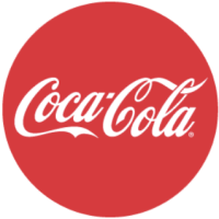
Source: Coca-cola.com
Feelings associated with red:
- Energy
- Power
- Strength
- Love
Red is known to be one of the most powerful colors. It grabs attention and is associated with intense emotions, like an angry charging bull. The color red makes people feel energized and excited. Coca-Cola uses a vibrant red for its logo that catches our eyes. What does red say about the product?
The soft drink is exciting and gives us an energy boost. Thanks to excellent marketing and the vigor of red, Coca-Cola has one of the most recognized logos in the world. Red is doing its job.
Yellow in Color Psychology – McDonald’s

Source: Mcdonalds.com
Feelings associated with yellow:
- Happiness
- Warmth
- Creativity
- Positivity
Yellow is the color of the sun, and there’s nothing more mood-lifting than a bright, sunny day. Yellow evokes feelings of warmth and cheerfulness. But it is also used to garner attention. Yellow, like red, makes you take notice. What is the most popular color for highlighters? (Hint: it’s yellow.)
Likewise, pedestrian crossing signs are often yellow for the same reason. They are designed to alert you. Of course, the golden arches alert you that a delicious hamburger is nearby and will be served to you in a warm and friendly environment.
Blue in Color Psychology – Facebook
![]()
Source: Wikipedia.org
Feelings associated with blue:
- Trust
- Responsibility
- Peace
- Predictability
Like the crashing ocean waves at a beach, the color blue gives us a sense of dependability. The tide comes in and the tide goes out every single day. The constant of the blue sky overhead is predictable.
Just how calming is the color blue? Blue lights were installed in Japanese train station platforms in 2009 in hopes of preventing suicides. And it worked. The number of suicides decreased by 74%. While there is no scientific evidence yet that supports this, it’s a pretty impressive claim.
The coolness of blue also evokes a sense of trust. Many banks and tech companies turn to this color, which makes sense knowing that they often deal with sensitive information and security.
Orange in Color Psychology – Blogger.com

Source: 1000logos.net
Feelings associated with orange:
- Optimism
- Adventure
- Spontaneity
- Confidence
Like the colors it’s comprised of, orange is a warm and welcoming color. With the cheeriness of yellow and the high energy associated with red, it’s color of optimism and adventure. There’s also confidence that it portrays.
The blogging website, Blogger.com uses orange to convey its identity. Blogging can be seen as an adventure. Creativity, optimism, and confidence are attributes of many successful bloggers.
Green in Color Psychology- Spotify

Source: Storage.googleapis.com
Feelings associated with green:
- Harmony
- Balance
- Tranquility
- Peace
Green evokes a sense of peacefulness and tranquility. It has a natural calming effect, reminiscent of time spent in nature. Music, like colors, can also drastically affect moods, so it makes sense that Spotify would use a color that quite literally represents harmony.
Purple in Color Psychology – Yahoo!

Source: s.yimg.com
Feelings associated with purple:
- Playfulness
- Whimsy
- Luxury
- Mystery
Purple is a blend of the high energy of red balanced with blue’s calming effect. It is a rare color to find in nature, giving it a sense of mystery. Traditionally, purple is also used to represent royalty, thereby suggesting luxury. W
hile Yahoo! may not be a luxury brand, there is playfulness in the branding, making purple just the right choice.
Black in Color Psychology – Chanel

Source: Wikimedia.org
Feelings associated with black:
- Authority
- Power
- Sophistication
- Classic
Black is simple, sophisticated, and makes a statement. The color is timeless, formal, and dramatic. Because of this, it is often used for sophisticated and classic brands, like Chanel.
White in Color Psychology – The North Face
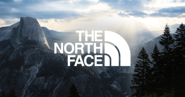
Source: Thenorthface.com
Feelings associated with black:
- Clarity
- Purity
- Uplifting
- Innocence
White is unique in that in the absence of other colors it cannot stand alone. It will always require a background color. However, given the right background color, white can “pop” and evoke the emotions desired by the brand. According to LogoMaker, The North Face is named for “the coldest and most unforgiving side of a mountain.”
The white color choice reflects the brand’s link to snow and winter. But it’s also representative of keeping nature clean and pure. Part of their brand mission is to protect nature.
Tips for Creating Color Palettes and Color Schemes
You now have a foundation of how color theory and the psychology of color work together. What are some tips for selecting your palette?
Use the RYB Color Wheel to Choose Color Schemes
When deciding on the right color scheme for your brand, begin by looking at the RYB color wheel. This is one of the simplest ways to choose your color scheme and understand what type of scheme you are using.
Once you know your color scheme, you may choose your actual palette colors based on the RGB color system simply because it is how the colors are translated into the light on the screen.
Source: Stock.adobe.com
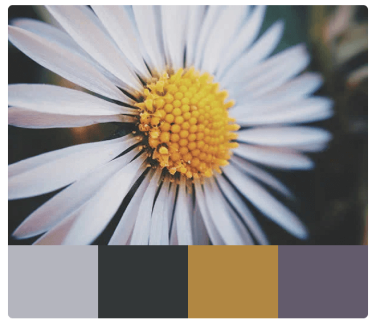
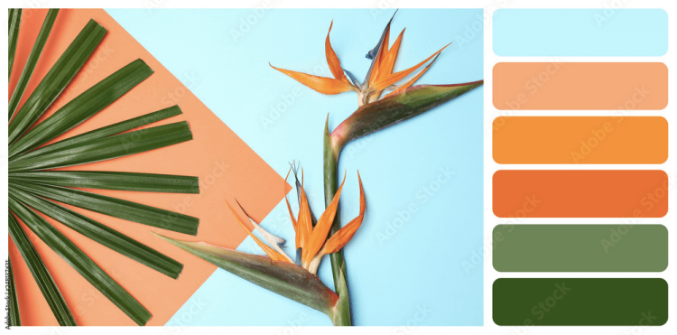
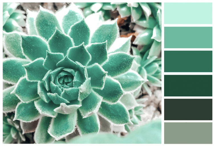
Photos can serve as inspiration. Use your own photo or search online for images that capture the feeling you want to convey. Whatever image you use should contain the essence of your brand. Coolors and Canva both have tools that will pull a color palette from images you upload.
Don’t Use Hues in Equal Amounts
It is important to vary the saturation of your colors. If you use pure hues for all of your colors, your design may be too busy and bright. For a softer and more elegant pattern, you will want to pair more vibrant hues with varying tints, shades, or tones.
Best Color Scheme Generators
With today’s technology, you don’t need to go mix paints to figure out your colors. There are quite a few great color palette generators that can help you quickly find the right color palette for your brand.
Coolors
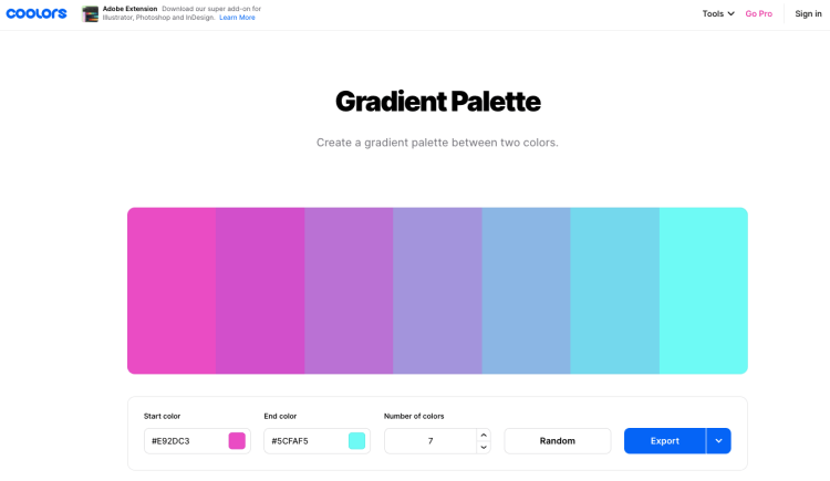
Source: Coolors.co
Coolors offers a simple way to generate random color palettes. While generating different color palettes, you can keep the colors you like and swap out the ones you don’t. Or, create a gradient palette by picking a start and end color. You can also explore pre-made and trending palettes.
Coolors also has an Image Picker tool that allows you to pull a color palette from an image or photo. Another excellent feature that Coolors offers is the blindness simulator which shows what your color choices might look like to a person with color blindness.
Paletton
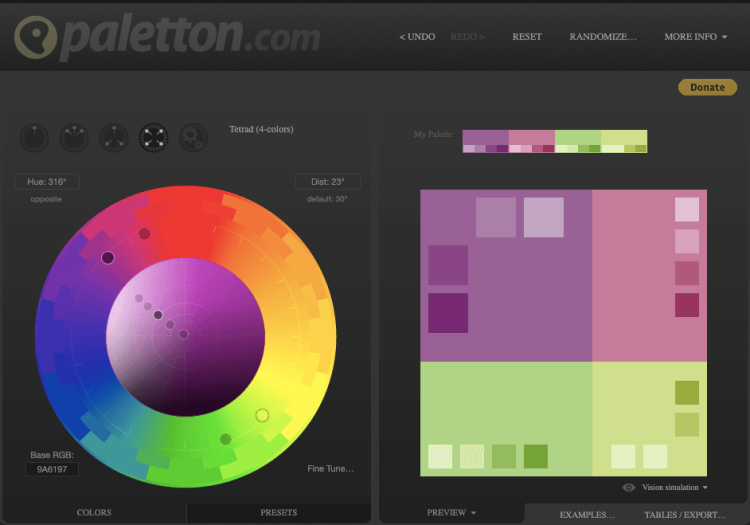
Source: Paletton.com
Paletton is an easy-to-use color palette generator that doesn’t require an in-depth understanding of color theory. Select your base color and the color scheme you’d like to explore. From there you can fine-tune your color choices by playing with the saturation. There are also preset options to choose from based on your color choices.
Color Hunt
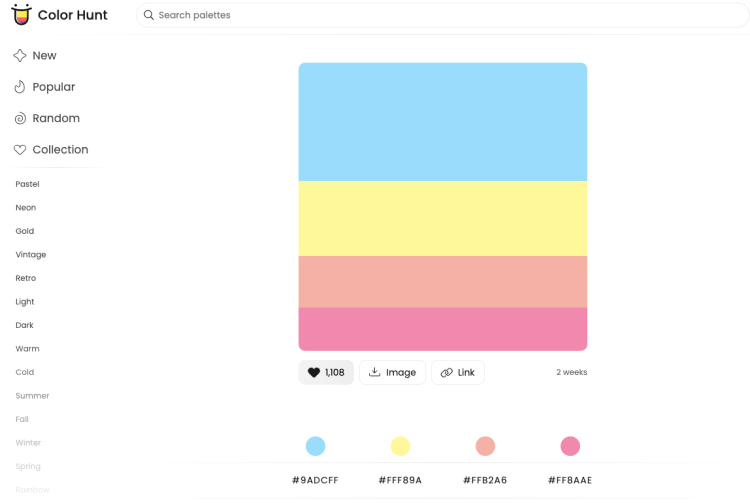
Source: Colorhunt.co
Color Hunt is a social media platform devoted to color palettes. Users create and share palettes within the platform. You can search for popular palettes from a variety of categories. Save your favorite palettes to your collection or download them.
Canva
Canva has two helpful tools for putting together a color palette. The first is the Canva Color Wheel which explains the basics of color theory and uses an interactive RGB color wheel that allows you to explore combining colors based on common color schemes.
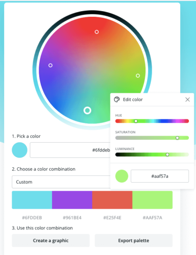
Source: Canva.com
The second tool is the Canva Palette Generator which uses photos or images to create a palette. Canva has demo photos available, or you can upload your own image.
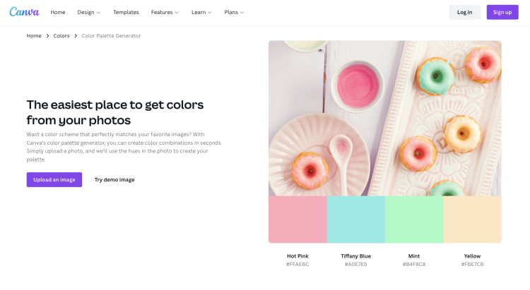
Source: Canva.com
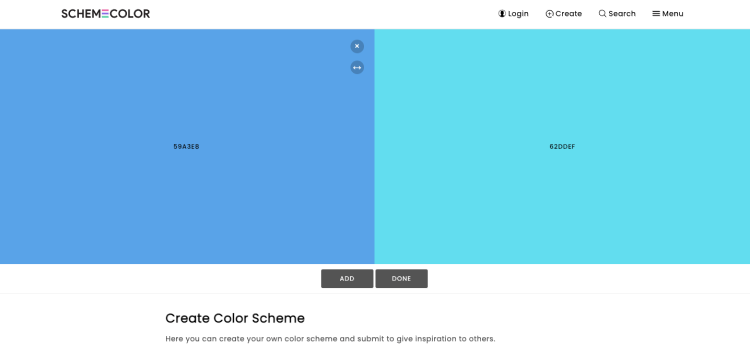
SchemeColor
SchemeColor is another site for creating and sharing color palette ideas. The site allows you to search by color, theme, or keywords. You can also create your own color schemes by selecting colors from a gradient color grid.
Source: Emecolor.com
How will you enhance your marketing blog using color?
There are a few common mistakes you should be watching out for when creating a website color scheme.
First, some colors might be too bold for your exact niche, or the message you’re trying to convey to your website, and visitors. So be careful when using more powerful colors, especially when combining them.
You might end up creating an aggressive palette that annoys or somehow makes the reader anxious. That’s too much pressure and ruins the reading experience.
Brand consistency is key here. Once you change your color scheme or add a new color to your existing one, go back to the old pages and see where it can be added. Do that with your profiles on social media too to remain consistent and easily recognizable.
Stay away from darker backgrounds. Not because it can’t be effective, plenty of websites have a black one. But if you aren’t working with a professional or aren’t sure whether it will work for your audience, it’s much better to use light color shades.
They won’t lead to making big mistakes with design, will keep the minimalist look that everyone will like, and will let the rest of the content stand out.
Next, there are colors that should be avoided due to their effect on the human eye. Neon colors, for instance, can be irritating. Vibrating ones, or too much brightness due to the color combination, might create a blurring effect that’s quite unpleasant for the visitor. So stay away from that too.
Last but not least, don’t just go to your competitor’s website and do the same. It won’t work for you. Each audience has different preferences, and your unique value proposition can’t be shared with the world this way. You can learn from the best as shown above, but always change things a bit and add a personal touch.
Over to you now.
What are your primary and secondary colors and how are you going to combine them? Where on your marketing blog will you include them first and why?
FAQs
What colors attract customers?
If you want to attract a customer’s attention, red is going to be your best bet. It is warm, bold, and bright. Red signals to the brain to pay attention. It is particularly effective when presented in an emotional context, which is why we see it regularly used for marketing.
What color increases sales?
Color can influence a person’s decision to make purchases, but sales still have more to do with the person’s current mood. Some studies suggest red will increase impulse purchases because it triggers action. However, because blue comes across as reliable and trustworthy, it may indirectly increase sales by alleviating anxiety.
Which color combination is best?
There is no hard and fast answer for which color combination is best for marketing. Ultimately, you want color combinations that are high contrast and aesthetically pleasing. While you want to consider how your brand colors will affect a potential customer, it’s equally important to consider what the colors say about your brand identity.
You might be interested to check those related posts as well:
- The Best 130 Salon Names [for Your Beauty Business] 2024
- How to Remove Red Filter on Silhouette Challenge 2024
- Let’s Learn How to Create Little Miss Memes
Conclusion
There is a lot to consider when choosing the colors that will represent your brand, and it may seem daunting. But with a foundation in color theory and an understanding of color psychology, you’ll be able to find the perfect color combination for your brand.
If you don’t know where to start, simply begin with your favorite color. Try different schemes and play with saturation levels. Don’t be afraid to be bold.