
In today’s internet age, data is everywhere. There is likely more data than you know how to comprehend. Data visualization tools can help you understand the various layers and patterns hidden within the data.
What are the Main Reasons for Using Data Visualization Tools and Software?
- Annual Reports
- Analytic reports
- Charts
- Dashboards
- Investor slide decks
- Sales and Marketing
- Software Testing
- Templates
- Visual Summaries
- Showing trends, patterns, and relationships
- Any other situation in which data needs to be broken down and demonstrated visually
Best Data Visualization Tools and Software this 2024
There are plenty of data visualization software tools out there to use but knowing which one is best for any situation is important. Below is a list of some of the best data visualization software to choose from.
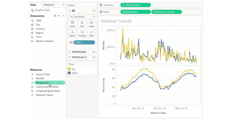
1. Tableau Creator – Best Presentation Visualization Software
Tableau is famous for taking in large data sets and producing visualizations within a short period of time. It can also be used to create actionable insights that can be shared with teams, other professionals, and on the web. It has a desktop app, an online version, a mobile version, and a free public option: Tableau Public.
Their gallery of infographics and visualizations is a great starting point for any sort of quantifying data. Tableau is also easy-to-use. It is great for either a single data analyst or a corporation looking for a built-in data visualization solution. The suite of products is ideal for secure collaboration throughout the analytical workflow.
It also runs at least 10x faster than other data visualization tools when it comes to producing graphics from data, regardless of whether you are working on your phone, a tablet, the web server, a laptop, or a desktop computer. Tableau recognizes that in many situations, we are now a mobile-first society.
Pros:
- Variety of data import options
- Robust mapping capability
- Sharing and collaborating securely
- Video tutorials and how-to’s
- Extensive customer support
Cons:
- The public version does not allow analyses to remain private
- No option for automatic refreshing of reports
- Column table formatting is known to be difficult
Pricing:
- $70 per user, per month
2. Looker – Best Interactive Data Visualization Software
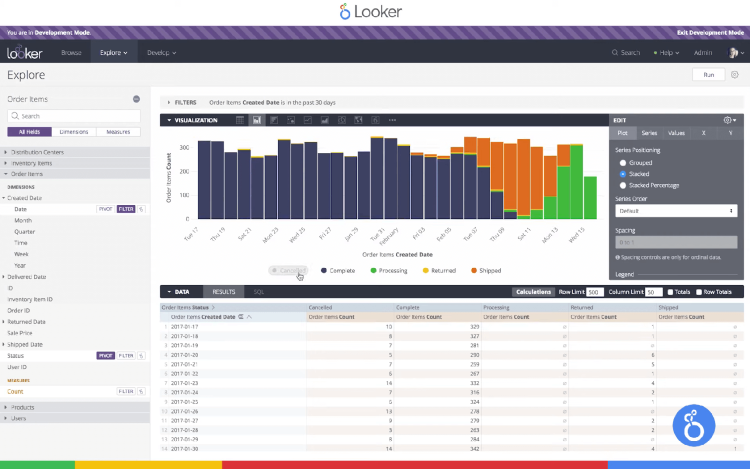
Looker is a team-oriented BI platform that provides real-time interactive dashboards and more in-depth data analysis for faster decisions. The dashboards are both interactive and dynamic. Looker can point out changes and irregularities in the data so that issues can be caught early. Looker can also be connected to more than 50 SQL-supported dialects, allowing it to connect with multiple databases.
Looker is designed to be as user-friendly as possible to maximize an efficient workflow. A single dashboard can be filtered dynamically and provide the best sort of information to a variety of people. The visualizations can be shared across many tools and exported in any format instantly.
This data visualization software offers a library of options for data. If what you need isn’t there, you can build your own. Looker can take on large data sets and break the big data into whatever data visualization solution is necessary.
Pros:
- Easy-to-analyze dashboards
- Filter by individuals or groups
- Ease of combining charts
- Fast learning curve
- Easy queries in the data
Cons:
- LDAP integration setup is complicated
- Limited help documentation without contacting customer service
- The dashboard lacks some visualization options
Pricing:
- $3000/month for 10 users
- However, this is an estimate, Looker requires quote inquiries for an accurate price
3. Zoho Analytics – Best Data Visualization Tool for Enterprise
Zoho Analytics is both a business intelligence tool and a data analytics software. The smart assistant Zia is created using artificial intelligence, machine learning, and natural language processing; and it can help you with any questions you may have or help augment data analysis. Zoho is also accessed via a web browser, so all updates are instantaneous.
Zoho allows visualizations to be modified easily with an edit design tab. The dashboard design can be customized to whatever your company needs at the time. Filters enable collaborators to access data in a straightforward manner. One report will have multiple views which streamlines efficiency. Each visualization can also show up on the dashboard as a separate slide.
Zoho Analytics also offers a free trial and a free version for you to test out prior to committing. Zoho’s price also puts it at a reasonable data visualization software for what you are paying.
Pros:
- Smart assistant Zia
- Easy-to-follow interface
- Good customer support
- Ideal for general business users
- Strong security policies
Cons:
- Steep learning curve
- Reporting features can be frustrating
- Plans can get pricey, especially when adding additional users
Pricing:
- Basic plan: $24/month, billed yearly
- Standard plan: $48/month, billed yearly
- Premium tier: $115/month, billed yearly
- Enterprise edition: $495/month, billed yearly
4. Sisense – Best Cloud Data Visualization Software
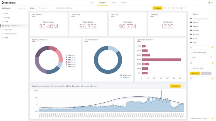
Sisense is a data visualization solution that is business intelligence-based and allows data scientists to take complex data and acquire actionable insights from it. It connects easily to third-party applications such as Skype or Slack and data can be pulled from those apps intuitively. It also touts itself as the leading cloud analytics platform.
Sisense is easy to set up and learn. Data can be pulled from multiple sources and results are near-instantaneous. The user interface is intuitive and the data visualization capabilities are broad. Files can be exported in a wide variety of formats and shared easily.
While Sisense lacks a data visualization library as large as other data visualization software and tools, Sisense instead offers a broader range of insights and data analysis. The analytics can then be embedded into other apps and locations for easy access.
Pros:
- Natural language query in third-party applications
- Integrates well with other analytics and apps
- In-chip processing enables it to run faster and pull data from more places
- Work can be deployed through the cloud
- Role-based security
Cons:
- Unnecessarily complex in areas
- Limits on the natural language features
- Not a good starter program for people who do not already have a basis in BI or data analytics
Pricing:
- Must ask for a quote
5. Qlik Sense – Best AI Data Visualization Software
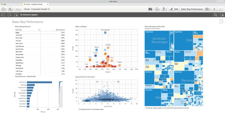
This data visualization software provides an associative data analysis engine bolstered by an Artificial Intelligence machine learning system. The software is big on associations and tries to mimic human brain thinking patterns. The longer you use Qlik Sense, the more it can provide relevant insights. It is a modern data analytics platform for a modern BI solution.
Regardless of the size of the data set, or how many sources the data is coming from, Qlik sense will allow you to visualize and explore your data with interactive data visualization and interactive charts. The data charts are updated in real-time to give you accurate and current data. The data integration and analytics can then be turned into actionable insights.
Qlik allows for interactive visualization, customizable dashboards, advanced data analytics, and the ability to view data from multiple devices. With integration with Qlik Cloud, the data can be hosted in any combination of public cloud, private cloud, and on-premises sites.
Pros:
- Various forms of data presentation
- Maintains data association automatically
- Fast integration of data from multiple sources
- End-to-end cloud platform in real-time
- Fast data modeling
Cons:
- Steep learning curve
- Requires prior knowledge
- Costly for larger companies
Pricing:
- $30/user per month, billed annually
- Enterprise plan requires a quote from their sales department
6. Microsoft Power BI – Best Windows Data Visualization
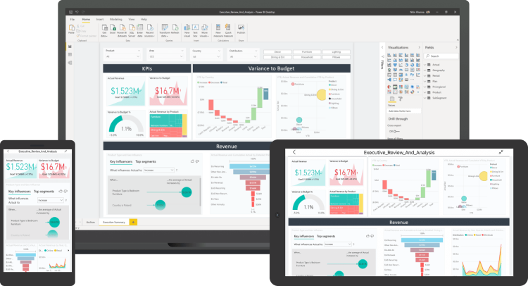
As Microsoft owns Power BI, it is the easiest one to use and integrate with Windows. Microsoft’s business intelligence data visualization platform is actually very cost-effective at only $9.99 a month per user. It offers a big library of data visualizations, artificial intelligence capabilities, and integrations with other Microsoft products, namely excel.
Power BI’s analytic tools make it easy to analyze and aggregate data meaningfully, allowing you to create interactive dashboards, charts, and reports. There are plenty of stock visualizations but more can be purchased from the Office Store for no additional cost. The visuals are easy-to-follow and do not get congested easily.
There number of connectors and servers and that number is only growing. Power BI can be accessed from the desktop version, web browser, or mobile phone. The community is not only helpful for creating visualizations for you to use, but it also offers support if you are stuck. Plus there is a lot of documentation to help you get started.
Pros:
- Easy-to-use
- Integrates seamlessly with other Microsoft Office Products
- Excellent data visualization capabilities
- Real-time updates on the dashboard
- Community-driven visualization options
Cons:
- Certain features are split between desktop and web versions
- The free version does not allow a decent refresh cycle
- Sometimes hangs with large data sets
Pricing:
- Professional plans beginning at $9.99/user per month
7. SAP Analytics Cloud – Best Real-Time Analytics in Data Visualization
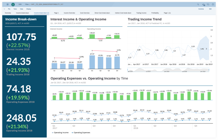
SAP Analytics has created a data visualization tool that is a BI solution to help evaluate big data, create visualizations, and predict business outcomes. It has augmented and predictive analytics built into its cloud. SAP Analytics Cloud has a competent error-flagging alert system, conversational artificial intelligence, and natural language technology. The analytics are a hybrid of machine learning artificial intelligence and gleaning from the community.
SAP Analytics Cloud is perfect for data scientists and data professionals. It does require some previous knowledge, but it is a powerful data science solution. It also has competitive pricing that makes it a viable option for larger businesses. The data visualizations can be customized to a variety of people and purposes.
This data visualization software has apps for both mobile and iOS, as well as the desktop version. Publishing to mobile is very easy with SAP Analytics Cloud. They tout being a single solution for a business or enterprise.
Pros:
- Real-time analytics
- Easy mobile publishing
- Storytelling paradigm with templates
- Centralized and consolidated view options
- Easy customization of visualizations
Cons:
- Toolbars can be confusing
- Underwhelming data prep features
- Steep learning curve
Pricing:
- Business Package starting at $22/month
8. Infogram – Best WordPress Data Visualization Plugin
This is an easy and interactive data visualization tool because the data can be dragged and dropped into different areas that help even the most inexperienced person create effective visualizations in the form of infographics, maps, and charts. The visualizations can then be exported to a wide number of formats.
Inforgram also allows for interactive visualizations for websites or apps, and there is a specific WordPress plugin to streamline the process of exporting to WordPress. Infogram is web-based, so there is no software to download.
While higher tiers of Infogram are ideal for corporations or even the government, there are student-friendly options or even casual designer options. The key features are highly intuitive and there is no coding skill required. The platform can also handle complex data even at the free level.
Pros:
- Reasonably tiered pricing
- The free plan comes with basic features
- Variety of chart and map types
- Drag and drop editor
- API allows for easy import of additional data sources
Cons:
- The free version does not allow rich text editing and the Infogram logo is mandatory in free designs
- Navigating the data can be challenging at times
- Lacking certain data integrations and sources
Pricing:
- Most essential features are included in the free plan
- Pro version: $19 per month
- Business version: $67 per month
- Teams version: $149 per month
- Enterprise version: contact Infogram
9. ChartBlocks – Best Free Big Data Visualization Software
This visualization tool offers any type of chart you can think of, and it also helps you pick the right data for the right chart before the final visualization. ChartBlocks claims it can import data from anywhere within a few clicks. Whether you are using the software or the app, you can update your data easily.
Charts can pull data from multiple sources and the data import wizard will walk you through the steps if you are new to the process. This is a great data visualization software for people who do not have any previous coding experience.
There is a big library of different charts, and you can create multiple charts per data set. Once you have created your chart, you can embed it on a website or share it on social media without any hassle. Alternatively, you can export them as editable vector graphics.
Pros:
- Easy importing
- Robust free plan
- Excellent customer support
- Social media tools built-in for direct sharing and posting
- Adapts seamlessly to screen size
Cons:
- No mapping capabilities
- The free version has limited export quality
- Limited space for data upload
Pricing:
- A free plan that includes all key features for up to 50 charts
- Paid plans starting at $20/month
10. Datawrapper – Best Open Source Data Visualization

Datawrapper is a web-based data visualization tool that allows you to create interactive charts, maps, and tables to embed on websites or integrated with Google Products. Once all your data is in, the charts are created in a matter of a few clicks. Datawrapper easily generates bar charts, pie charts, scatter plots, and plenty of other graphs for your needs.
Datawrapper makes it as easy for readers to view and understand the data the visualization is trying to convey as it does make it easy to create the data visualization, to begin with. It is highly suitable for students, small organizations, and newsrooms.
Datawrapper is also an open-source tool that is supported on Windows, Mac, and Linux. And regardless of whether you have the free plan or the paid plan, all visualizations and other data are private until you publish the finalized visualization.
Pros:
- Designed for newsroom data visualization
- The free plan is excellent for smaller-time users
- Tools include a color blindness checker for ease of understanding the visualizations
- Visualizations are automatically scaled to the screen size of the device
- No need for coding skills
Cons:
- Limited data sources, all data must be copied into the tool
- Paid plans get pricey quickly
- Customizations are limited in the free version
Pricing:
- Paid plans starting at $39/month
11. Grafana – Best Free Dashboard Data Visualization
Grafana is another open-source data visualization software. It has a free downloadable option as well as a limited free cloud-hosted option. Grafana also has paid plans with more features but the free features are nothing to scoff at. It is one of the best options out there for creating and working with dashboards.
The dashboards are dynamic and Grafana supports annotations, customizable alerts, and mixed data sources. Data scientists can share snapshots of the dashboards, or invite others to collaborate. There are plenty of plug-ins for more data sources.
Grafana prides itself that the downloadable version is forever free and remains useful. The open-source capabilities keep the software competitive. There are paid support options for enterprises should you need some more assistance and features. Otherwise, the open-source self-managed options are still robust and workable for administrators.
Pros:
- Robust free version
- Large selection of data sources
- Simple creation of dynamic dashboards
- Easily work with multiple data feeds
- Variety of charts and dashboards to choose from for visualization
Cons:
- Lacks certain customizable features
- No embed option for websites
- The software can be overkill for simple visualizations
Pricing:
- Cloud-hosted version for $49/month
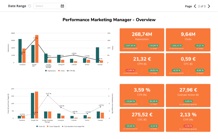
12. Databox – Best Ad Data Visualization Software
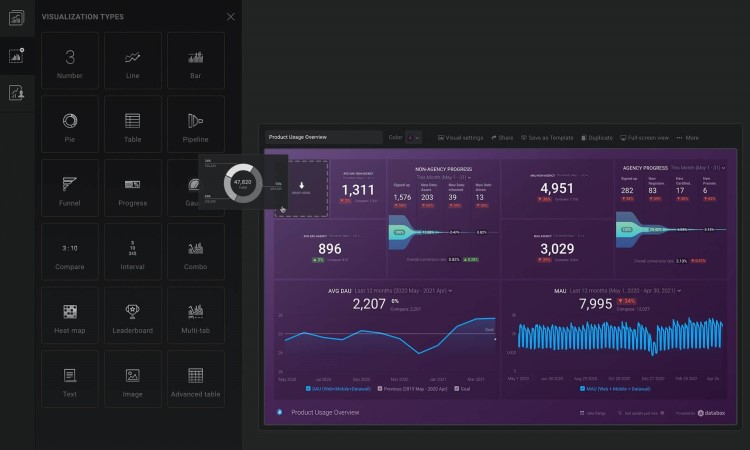
Databox is perfect for putting all data into one place and updating visuals in real time. There’s no coding experience necessary to get stunning and effective dashboards. It is easy to use and can be deployed to marketing teams quickly.
It integrates easily with Google Analytics and other google products. It is also great for working with ad data, both with Google Ads and Facebook Ads. Data can be tracked from any device and Databox’s dashboard designer allows you to customize the look and presentation of your dashboard, pull the metrics you need for any situation, and visualize your KPIs in whatever manner you need.
In addition to dashboards, Databox allows you to create performance scorecards, set alerts and notifications for different metrics, and create comprehensive reports from multiple connected dashboards.
Pros:
- Large library of data sources
- Easily customizable dashboards
- At your fingertips KPI tracking
- Easy to set up and minimal learning curve
- Great for automating reports
Cons:
- No individual plan for those who need more than 3 data sources
- Plans can get disproportionately pricey
- Hard to cancel a subscription
Pricing:
- The free plan allows 3 users and 3 data sources
- Paid plans range from $49/month to $289/month
13. Juicebox – Easiest Data Visualization Tool to Use
Juicebox is an easy-to-use data visualization tool with no learning curve. It is the perfect design tool for users with no previous technical experience. Juicebox allows you to pull from multiple sources to create the visualization. Then it walks you through creating whatever interactive data visualization or presentation you need.
Dashboards can be customized within an organization, for shareholders, or for the public. Regardless of who the audience is, Juicebox offers an option for data visualization. You can make interactive infographics, interactive dashboards, and interactive charts, as well as exploratory analytics, executive dashboards, and survey analytics.
Juicebox allows for an easy transition from Excel, PowerPoint, Google Sheets, and Slides into data visualization software with no coding experience required. If you do require extra assistance, Juicebox offers video tutorials, documentation, and a Help Center.
Pros:
- Interactive data visualizations
- Simple but professional styling options for visualizations
- Adjustable layout for mobile viewing
- Easily distill data into actionable insights
- Import and export data easily
Cons:
- Web-based only
- No ability to make changes at the code level
- Can be frustratingly simple for some technical users
Pricing:
- The free plan allows unlimited apps for up to three team members
- Team plans start at $49 per month
14. Whatagraph – Best Marketing Data Visualization Tool
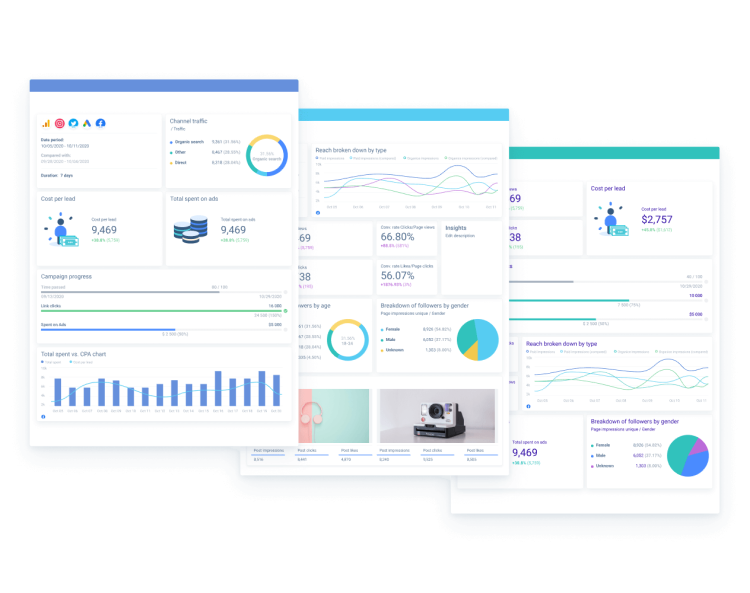
Whatagraph is a data visualization tool for comparing and monitoring data. You can transfer custom data from Google Sheets and there are custom API plug-ins for more data streams. Whatagraph charges based on the features you need, so you will not need to pay extra for some features when you are not using others.
The data visualizations are easily customizable for the different audiences your corporation may need to present to. Whatagraph has automation features that will help cater the data to the correct client. The automated performance reports can be scheduled to come out on whatever basis you want and will then go out without further input from you.
Whatagraph is ideal for marketers and digital marketing agencies. It integrates with social media platforms and other digital marketing tools. If they are lacking an integration that you desire, you can put in a request for it and they will try to add that in the future.
Pros:
- Ready-to-use templates
- Easy collaboration
- Pay by the feature
- Robust automated features to save time
- Get easy-to-read insights
Cons:
- Prices can get very steep for more users
- Occasional issues with Whatagraph not pulling the right data
- Visualization layouts lack customization
Pricing:
- Professional plan: $119/month for one user
- Premium plan: $279/month for five users
- Growth plan: $699/month for unlimited users
15. Adverity – Best Data Visualization Software for a Pro
Adverity is perfect for reducing manual data collection and instead automating as many processes as possible. They have over 600 connected data sources for you to pull from and integrate into your dashboards. They also have a plethora of templates to choose from in order to maximize the efficiency of data visualizations.
The visualizations can then be customized and scaled to whatever purpose and whatever screen size they are being presented on. Adverity allows you to easily change the visualization or chart type, as well as table formats or filters. You can also effortlessly create individual data streams for whatever purpose you need.
Adverity is perfect for consolidating large data sets, providing peak data analysis, showing actionable insights, identifying opportunities, and generating more revenue. The data visualization software’s ability to pull from so many sources makes it ideal for tracking data from anywhere. And if you have any questions or concerns about how to make Adverity work, they have customer support that will answer questions around the clock.
Pros:
- Strong security
- Process big data sets quickly from multiple sources
- Built-in predictive analytics
- Good customer support
- Personalized dashboards for any occasion
Cons:
- Steep learning curve
- No task logging
- Data extraction can sometimes lag
Pricing:
- Contact Adverity for pricing
16. HubSpot – Best Sales Reporting Data Visualization Software
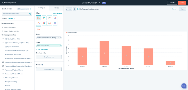
HubSpot is a visualization tool designed with reporting sales in mind. You can track your sales process including Deal Forecast, Sales Performance, Productivity, Deals Closed in relation to Goal, and Recent Activity. The dashboards are incredibly customizable, allowing you to choose exactly what shows up in the data range.
HubSpot also comes with a custom report builder where you can create customizable reports based on your data. These can then be easily shared amongst your team or with outside viewers. The user interface is streamlined and relatively easy-to-learn. HubSpot’s free and starter plans are aimed at small businesses with cost in mind.
Their free data visualization tools include ad management, email marketing, live chat, basic bots, data sync, App Marketplace integrations, ticketing, a shared inbox, and many more. If you need to remove the branding or want more marketing contracts, you can take a look at their licensed plans.
Pros:
- Easily customizable dashboard
- Flexible and powerful report builder
- Resize individual reports based on priority
- Dashboards that fit up to 10 reports
- Many features are free
Cons:
- No segmented traffic reports
- The free version requires HubSpot branding on all products
- Plans can get prohibitively expensive
Pricing:
- Robust free version
- Starter: $45/month
- Professional: $800/month
- Enterprise: $3200/month
17. Venngage – Best Infographic Maker
With its vast template library, Venngage is an infographic maker that helps you create all kinds of data sets. Whether you want to create graphs, or pie charts, or present your reports, Venngage offers all under one roof. Hence, whether you have to analyze a single data set or work on multiple data sets, Venngage helps you do it all with just a single click.
Once you have created the graphical data sets, you can easily share them with teams and present them online too. Therefore, you can easily share the reports via emails, newsletters, and on other social sites too.
Whether you want a data analysis solution for sharing healthcare data, the financial status of your company, or real estate data, all you need to do is sign up on Venngage and get the data analyzed in no time.
Pros:
- Hundreds of customizable templates
- You can host webinars, design courses, and publish blogs
- Offers all kinds of data analysis tools
- You do not need any experience to start working on Venngage
- Share your data on various channels or even download it in pdf form
Cons:
- Some templates require you to buy the business plan or premium plan
- The free signup option is limited to only 5 designs
- Limited customization in free version
Pricing:
- The premium plan is $16 per month.
- The business plan is $39 per month.
- The enterprise plan is $499 per month.
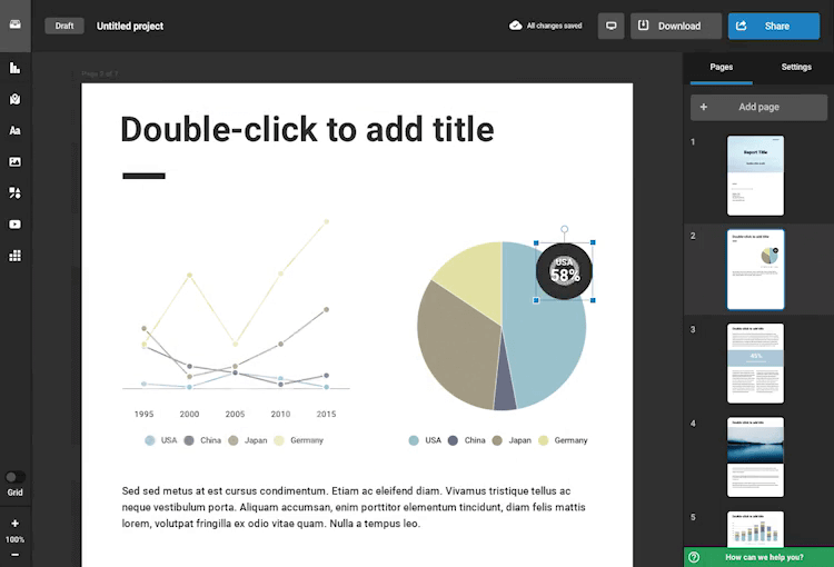
18. Storydoc – Best Business Report Visualization Software
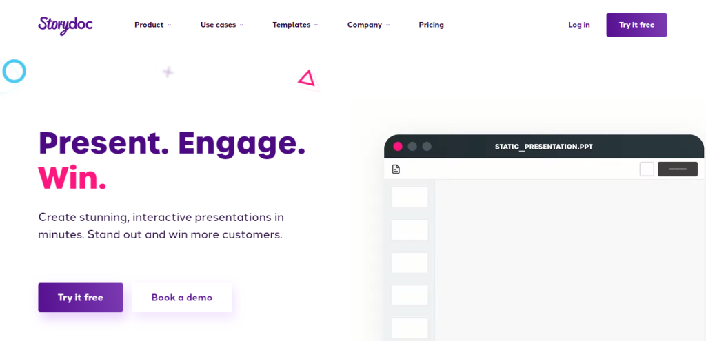
Storydoc is an interactive business report creator and data visualization software. Moving away from the traditional static reading experiences such as PDF and PowerPoint, Storydoc proposes a scroll-based story-like presentation of reports and many other business documents including one-pager, pitch deck, proposal, white paper, case study, and more.
Storydoc takes your business documents from static and boring to interactive engaging stories.The tool allows you to narrate complex infographics and provides immersive live graphs and charts readers can interact with.
Getting your data into your report is extremely easy through the tool interface and can also be pulled in from your CRM or an Excel sheet.
Pros:
- Engaging, uncluttered business reports
- Pre-built templates for long-form data stories and an array of other business use cases
- Interactive charts and infographics
- Integrations with CRMs and other sales solutions
- A built in document engagement analytics suite that lets you optimize your content to perfection
Cons:
- For best esthetic outcome a designer should be involved in document creation
- The tool provides only the most common data viz use cases as interactive content
- Tool does not provide the ability to manipulate live data
- Could be expensive for a one-off project
Pricing:
- Starter – $30/month per user (cheaper with annual subscription)
- Pro – $45/month per user (cheaper with annual subscription)
- Team plans – open to discussion
Best Data Visualization Software according to Reddit:
Tableau, qlik, power bi, tibco spotfire, etc., are similar tools. Learn one, and you can apply most knowledge to others. Focus on creating compelling visualizations and dynamic stories. Treat BI as having both a design and data component.
You might be interested to check those related posts as well:
- Top 6 Digital Analytics Software for 2024
- Top 5 Competitive Intelligence Software for 2024
- Top 7 Content Analytics Software for 2024
FAQ
What is the role of data visualization in data analytics this 2024?
Data visualization and visual analytics help paint pictures via graphs, charts, and tables. It enables the data points to be put in a form that we can easily read, rather than just strings of numbers and other data. Data visualization enables us to both analyze what it means, and what the next steps are.
What is interactive data visualization in 2024?
Modern data visualization software enables us to directly manipulate and explore the data in real time. Data can be identified, scaled, and linked to any number of data sources and then put into a form where it can be adjusted right in front of you, without waiting on updates.
What is big data visualization?
Raw data comes in many formats and usually needs to be transformed into a usable form. Big data visualization is the process of transforming the raw data into charts, graphs, maps, and other forms of visualization for the purpose of understanding what it all means and highlighting observations from the data points.
What is dashboard data visualization?
Dashboards are a type of data visualization tool that does a combination of track, analyzing, and displaying the data. This data can be software KPIs, metrics, data points, and any other number of usable data. Data analysts can turn this data into actionable insights, highlight decision-maker data, and see benchmarks.
What are the key components of data visualization?
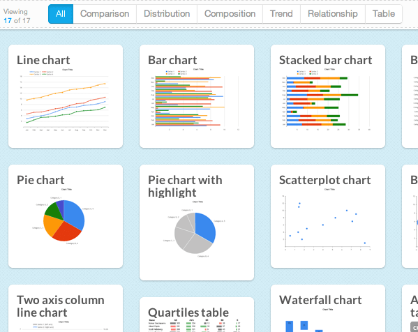
For data visualization to be clear and concise, the best elements to have include: clear headings, highlighted purpose, summaries of key points, relevant comparisons, obvious trends, and simple analysis. The best way to display this data can vary, but common options include, bar charts, line charts, area charts, pie charts, scatter plots, and bubble charts.
What are the different types of data visualization?
Here are some of the most common data visualization types and their uses:
- Column Charts or Bar Charts are used to compare data along two axes, one of which is numerical
- Pie Charts represent parts of a whole, with each wedge representing a relevant section of data
- Donut Charts are a subtype of Pie Charts, but you can have more sections without losing readability
- Line Charts or Line Graphs showcase changing data over time
- Scatter Plots analyze the correlation between variables
- Flowcharts visually describe a process or map
- Tables display comparative features
- Bubble Charts or Mind Maps are a web of shapes organized by concept and how they connect
Conclusion
There are plenty of data visualization software tools for you to choose from based on your business needs. The sixteen listed in the article above are an excellent place to start.