
Landing pages carry more weight than most marketers admit out loud. You spend all that time crafting campaigns, running ads, and fine-tuning targeting… and then watch users vanish the moment they arrive. It’s a punch to the gut. Especially when dropoff rates start climbing and conversions barely budge.
But here’s the thing: people aren’t leaving at random. There are patterns, signals, and fixable issues hiding in plain sight. You just need to know where to look and what to adjust.
Let’s go step by step and get your landing pages working like they should: converting curious visitors into action-takers.
What User Dropoff Really Means

User dropoff isn’t just someone clicking the back button. It’s when someone visits your landing page and bails before completing the intended action. That could mean ditching a signup form, abandoning a download, or ghosting your product trial halfway through.
Unlike bounce rate, which captures single-page sessions, dropoff is about multi-step processes. If someone clicks your ad, lands on your page, starts filling in their info, then disappears before hitting submit, yep, that’s dropoff.
Let’s say 1,000 users land on your signup page, and 250 leave before completing the form. That’s a 25% dropoff at that step.
Why Dropoff Wrecks Your ROI
It’s not just about lost conversions. Dropoff has ripple effects:
- You’re paying for traffic that doesn’t convert.
- Your customer acquisition cost (CAC) climbs.
- Your ad performance tanks because people bounce before the pixel fires.
- Your brand starts looking a little less trustworthy, especially if users keep quitting in the same spot.
Fixing dropoff makes your whole funnel healthier, from first click to final conversion.
Key Metrics That Actually Matter

Let’s make sure we’re all looking at the right numbers.
| Metric | What It Measures | Example |
| Bounce Rate | % of users who visit one page and leave | 50% = 5 out of 10 users don’t interact further |
| Exit Rate | % who leave from a specific page (regardless of path) | 30% = 300 of 1,000 users exit on that page |
| Dropoff Rate | % who abandon during a multi-step flow | 25% = 250 of 1,000 users leave during a signup |
Not every metric tells the full story, but together, they paint a clear picture.
Step 1: Set Up Analytics Properly
If you’re not tracking behavior, you’re flying blind. You can also partner with a website development in Melbourne agency to get your tracking infrastructure set up correctly from launch.
Start with:
- Google Analytics for bounce and exit rates
- Hotjar for heatmaps and recordings
- Userpilot for funnel tracking and feature usage
Make sure your key events are set up. Track:
- Button clicks (especially your primary CTA)
- Form starts and completions
- Scroll depth
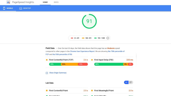
- Page speed metrics
Want to track if users click “Start Free Trial” but don’t fill the signup form? Set it as an event. Tools like Userpilot let you monitor those funnels step by step.
Funnels are your friend. You need to build step-by-step paths showing how users flow through your landing page into the next action. It might look like: If you notice that 60% of users click the CTA but only 20% complete the form, there’s friction in that form step. Now you know where to look. Use Google Analytics’ funnel reports, Userpilot, or Mixpanel to watch this play out in real time. Numbers tell you what’s happening. Recordings show you how. Fire up Hotjar or Userpilot session recordings and start watching: Scroll maps tell you how far users make it. If most people never see your CTA because it’s buried halfway down the page, that’s on the layout, not them. Data’s great. But sometimes you just need to ask. Set up exit-intent surveys that appear when someone’s about to bounce. Keep it short: Offer a few choices and leave space for open feedback. You can also interview users who visited your site recently. Aim for specificity. Don’t ask, “Did you like the signup?” Instead, go for, “Was there anything confusing about the signup steps?” Even minor technical issues can destroy conversion rates. Even shaving 0.1 seconds off load time can cut bounce rates by 8.3%. You’ve got the data. Now act on it. You fixed things. Nice. Now prove it works. Run A/B tests using: Test: But don’t just fire off random tests. Base them on what you’ve already learned from user behavior, recordings, and feedback. Also, monitor post-change performance: Portent ran a test that shaved load time from 4 seconds to 1 second. Conversion rates? Up by 2.5x. Here’s what conversion rates actually look like across different stages: Even small improvements can be huge wins. If your page goes from converting at 1.5% to 2.5%, that’s a 67% increase in leads, without spending a cent more on traffic. Let’s make it easy to remember: Consistency is the name of the game. You’re not just tweaking for fun, you’re shaping an experience that makes it easy for users to say “yes.” Landing page dropoff doesn’t fix itself. But it’s not some unsolvable mystery either. With the right tools, a little investigation, and focused changes, you can start closing those gaps, turning more visitors into signups, customers, or whatever next step matters most to your business. Watch the data, listen to your users, and keep refining. It’s not about chasing perfection. It’s about making every page work just a bit harder than it did yesterday. And when you start seeing those conversions tick upward? That’s the sweet spot. You’ve earned it.Step 2: Run Funnel Analysis and Spot the Drop
Step 3: Watch What Users Actually Do

Step 4: Ask Real People Why They’re Leaving
Tools to try:
Step 5: Clean Up Technical Headaches
What to check:
Step 6: Fix What’s Broken (With Intention)
What to optimize:
Step 7: Keep Testing. Always.
Industry Benchmarks (To Keep You Grounded)
Stage
Drop-Off Rate
Conversion Rate
Website-to-Signup
97.7%–99.1%
0.9%–2.3%
Activation Phase
63%
37%
Trial Conversions (Opt-In)
82%–83%
17%–18%
Trial Conversions (Opt-Out)
52%
48%
Recap
Final Thoughts