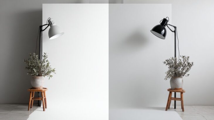
Background selection in product photography often determines how a customer perceives the brand.
A product may have excellent design and functionality, but the wrong setting can undermine its value instantly.
Professional backgrounds help convey credibility, highlight product details, and elevate overall presentation.
Balancing creativity with technical requirements is essential, especially when comparing e-commerce marketplaces like Amazon with custom brand websites to make money online.
Smart choices can influence customer trust, conversions, and overall business growth.
1. Classic White Background
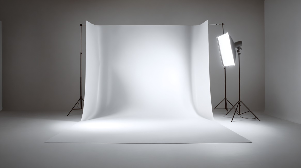
Clean, simple, and universally accepted, white serves as the foundation for product photography.
Customers browsing Amazon or Shopify listings expect clear and distraction-free visuals.
Such a setup ensures focus remains on the product itself.
- Pros: Universally recognized, easy to edit, and compliant with e-commerce standards.
- Cons: May feel sterile or uninspiring for expressive brands.
- Materials: Poster board, seamless paper, lightbox, V-flat.
Using bright, even lighting enhances edges and makes post-production editing easier.
While it may lack personality, white guarantees professional consistency and adaptability across multiple platforms.
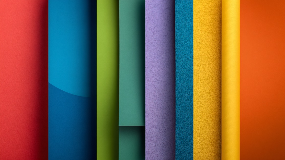
2. Textured Surfaces
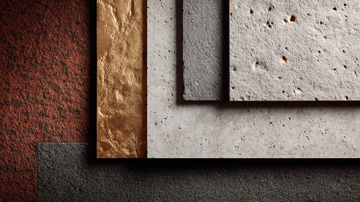
Textures in photography create depth and tactile resonance, even though viewers cannot physically touch the image.
A flat product shot against a smooth background may feel sterile, while a textured backdrop adds character, drawing the eye into details that emphasize quality and craftsmanship.
Materials such as marble, concrete, linen, and burlap enrich photos by adding subtle contrast.
Marble surfaces, for example, are commonly used for skincare and cosmetic products because they suggest purity and sophistication.
Concrete, on the other hand, introduces a modern, urban feel that pairs well with technology or industrial-inspired goods.
Burlap and wood grain are ideal for handmade or rustic items, signaling craftsmanship and organic origins.
Selecting the right texture depends on both the product and the emotions the brand wishes to evoke.
- Best for: Skincare, high-end jewelry, artisanal crafts.
- Types: Burlap, marble slabs, raw concrete, wood grain.
Lighting plays a significant role here.
Soft side lighting highlights patterns without overpowering the subject.
Combining texture with neutral tones creates contrast that elevates luxury perception.
Many brands use textures to tell a story about craftsmanship and exclusivity.
For even more refined options, professionals often use Gravity backdrops for photography, which combine artisanal finishes with durability to elevate product shots.
3. Off-White, Gray, or Neutral Tones
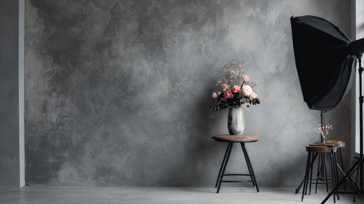
Neutral shades create warmth and subtle depth, making them ideal for natural or eco-conscious product lines.
A gray backdrop, for instance, reduces the “floating effect” often seen with pure white.
- Best for: Skincare, eco-friendly goods, minimalist fashion.
- Materials: Foam board, fabric, textured cardboard.
Brands like Fur and Meliora leverage soft tones to reinforce sophistication.
These colors ensure balance, drawing attention to product details without overwhelming the viewer.
Neutrals also adapt easily to both printed catalogs and online displays.
4. Bold & Solid Color Backgrounds
Brands targeting younger audiences or vibrant social media campaigns often use bold shades.
Color psychology plays a role here: red conveys urgency, blue suggests trust, and yellow radiates positivity.
- Tools: Adobe Color Wheel to find complementary or contrasting tones.
- Materials: Craft paper, vinyl, painted fabric, or custom canvas.
Strong colors work best when aligned with brand palettes.
A beauty brand, for instance, can use pink to amplify femininity, while a tech startup may prefer electric blue.
Bold backdrops catch attention instantly on fast-scrolling social media feeds.
5. Gradient & Ombre Backgrounds
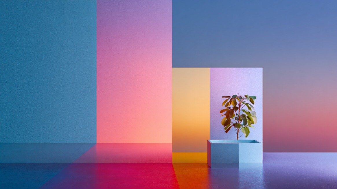
Gradients provide depth without distracting the eye.
Subtle shifts in color create elegance and sophistication, making them suitable for luxury products or tech-focused branding.
- Execution: Controlled lighting setups, printed vinyl, or digital editing in Photoshop.
- Tip: Use gradual transitions between complementary brand tones for sleek results.
Such backgrounds feel modern while maintaining visual softness.
A premium gadget placed on a gray-to-black ombre, for instance, communicates cutting-edge quality.
When handled carefully, gradients help products stand out without unnecessary clutter.
6. Patterned & Geometric Backgrounds
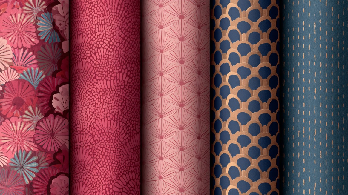
Patterns work well when targeting fashion-forward or lifestyle-focused audiences.
Geometric shapes add energy, while soft patterns suggest creativity and playfulness.
- Materials: Wallpaper, patterned fabric, tiles, or vinyl sheets.
- Caution: Patterns should complement, not overpower. Products must remain the focal point.
Examples can be seen in Florence by Mills, where bold geometric visuals highlight youthful spirit.
Designers should ensure balance between complexity and clarity, avoiding situations where busy backgrounds distract buyers.
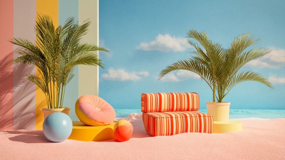
7. Natural Elements Background
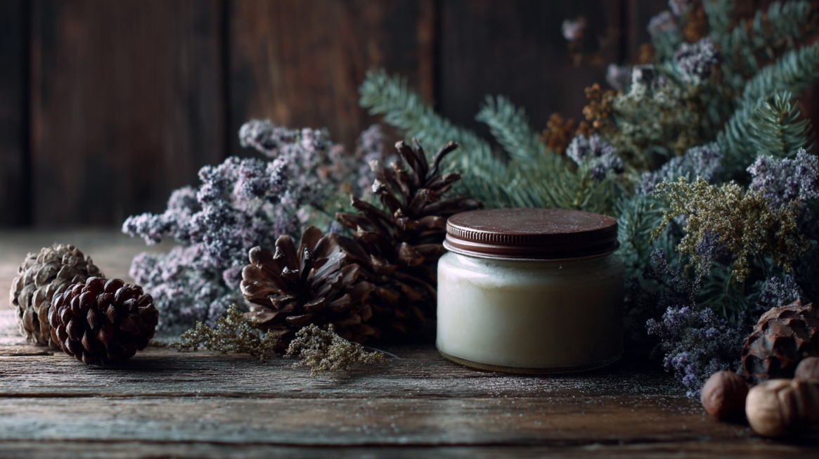
Organic settings emphasize authenticity and eco-conscious values.
Wooden planks, leaves, or stones add earthy tones that resonate with audiences seeking natural and sustainable products.
- Elements: Wood, plants, sand, stones, foliage.
- Budget Tip: Reclaimed wood or DIY textures reduce costs while maintaining aesthetics.
Lifestyle brands often place products in natural settings to reinforce sustainability.
A handmade candle photographed on wood with leafy accents instantly conveys an artisanal feel.
Such backgrounds help build emotional connections with eco-minded consumers.
8. Lifestyle & On-Location Backgrounds
Context often increases relatability. Products shown in kitchens, offices, or outdoor spaces provide aspirational value.
Customers can visualize how items fit into their daily lives.
- Locations: Kitchens, urban streets, home offices, gardens.
- Technique: Use shallow depth of field (bokeh) to soften distractions.
Lifestyle backgrounds require careful planning to avoid clutter. Props should feel natural, not forced.
For example, a coffee mug photographed on a morning breakfast table communicates comfort and authenticity.
Such storytelling techniques elevate brand messaging.
9. Reflective or Mirror Backgrounds
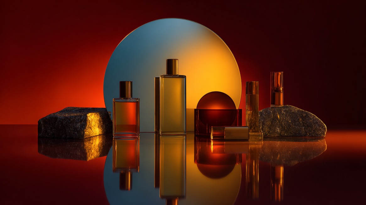
Reflective surfaces amplify sophistication and modern aesthetics. Jewelry, watches, or tech gadgets look elegant against mirrored glass or acrylic sheets.
- Materials: Glass panels, acrylic sheets, polished metal.
- Pro Tip: Clean surfaces thoroughly and use controlled lighting to avoid smudges and glare.
Reflections double the visual impact without additional props.
A luxury perfume bottle mirrored on a polished surface exudes refinement.
These backgrounds demand precision but reward photographers with stunning, high-end results.
10. DIY & Creative/Seasonal Backgrounds
Budget-conscious brands often rely on DIY creativity.
Household materials, seasonal props, or digital backdrops allow full customization.
- Examples: Holiday-themed cardboards, painted backdrops, green screen effects.
- Tools: Canva templates or affordable printed sets.
Seasonal campaigns benefit most from this approach
A handmade product can be styled with festive decorations, instantly adapting to different sales periods.
DIY backgrounds keep costs low while encouraging experimentation, giving small businesses a chance to stay competitive.
The Bottom Line
Backgrounds influence perception, branding, and conversions more than many realize.
Choices should align with brand voice, product category, and marketing objectives.
Experimentation remains key, as not all settings work equally well across different platforms.
Professional setups don’t need to be expensive. Simple props, natural light, and thoughtful editing can transform even budget-friendly scenes into polished campaigns.
Read more: Find photography blogs that can help you get more creative and find more ideas!