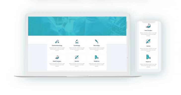
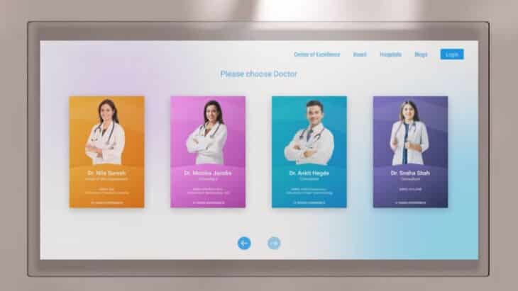
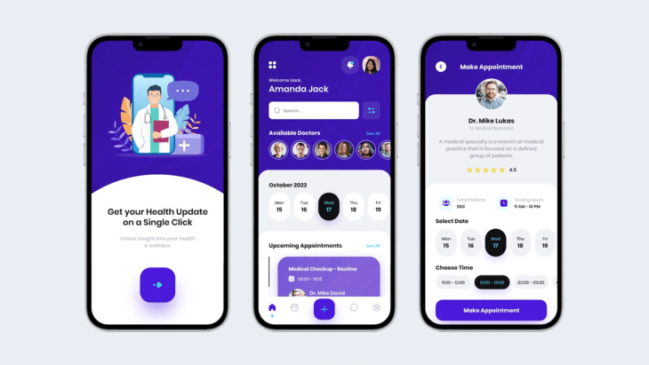
People rely on health websites for trustworthy information about symptoms, diagnoses, and treatments. The design of these websites influences how much visitors trust what they see.
A well-planned user experience can make a person feel confident in the content, while poor design raises doubts.
This article explores how UX design affects visitor trust, focusing on the practical elements that matter most when it comes to sharing health-related knowledge online.
Table of Contents
ToggleClean and Organized Layout

Users need to find what they are looking for without any hassle.
When the design feels clear and easy to follow, it makes the information seem more reliable.
- Clear Headings: Use headings and subheadings so visitors can quickly spot important information.
- Plenty of Space: Having enough space between different parts of the content keeps things from feeling cluttered or overwhelming.
- Logical Flow: Information should follow a natural order, guiding people smoothly from one section to the next.
Readable and Clear Content
People visit health sites to understand complicated medical information, so everything needs to be easy to digest.
If the content is confusing or full of medical jargon, visitors might question the site’s reliability.
- Simple Language: Use plain words that everyone can understand. Avoid medical terms unless absolutely necessary, and explain them when you do.
- Short Paragraphs: Keep paragraphs short and to the point. It makes content easier to read and less intimidating.
- Bullet Points and Lists: Breaking up information into lists or bullet points helps people scan quickly and absorb key details.
We’ve explored various websites, and cprcertificationnow.com is one of the best examples of how a clean and readable style can make it easier for visitors to find what they are looking for. In this case, it is about some discounts. As you can see, there is a simple drop-down menu and several other options you can select to get the preferred group discount.
High-Quality Visuals

Trustworthy images and graphics add a sense of professionalism, while blurry or irrelevant visuals can make users feel uneasy about the content.
- Professional Photos: Use clear and relevant images, like photos of healthcare professionals or facilities, to support the information.
- Accurate Infographics: Well-designed infographics help explain complicated health concepts in a way that’s easier to understand.
- Consistent Style: Make sure all visuals have a similar look and feel, which gives the site a cohesive and polished appearance.
Mobile Responsiveness
As of 2024, mobile devices account for 68.35% of all internet traffic worldwide, a significant increase from prior years. This means more people are searching for health information on their phones rather than on desktop computers. A website that fails to offer a smooth mobile experience risks losing trust and engagement from a large portion of visitors.
Mobile users often look for quick and easily accessible information, especially when dealing with health concerns. If a site does not adapt to different screen sizes or loads slowly on mobile, users may feel frustrated and leave, which damages the site’s credibility.
In contrast, a responsive design ensures that everything from text to images fits well on any device, creating a seamless experience that feels professional and reliable.
Additionally, websites that are not mobile-friendly may suffer in search engine rankings. Google prioritizes mobile-responsive websites, making it harder for non-optimized sites to reach audiences.
Loading Speed
People searching for medical information often need answers quickly, and a site that takes too long to load can cause frustration or anxiety. Moreover, slow websites can give the impression that the site is poorly maintained or unprofessional.
How to Improve Loading Speed?
Optimize Images
Large images are one of the biggest culprits behind slow websites. Compress images without losing quality using tools like TinyPNG or ImageOptim.
Minimize HTTP Requests
Reduce the number of elements like images, scripts, and CSS files on each page.
Enable Browser Caching
Browser caching stores elements of your site on a visitor’s device, so they do not have to reload everything when revisiting.
Use a Content Delivery Network (CDN)
A CDN distributes your website content across multiple servers around the world, making it load faster by serving it from the server closest to the visitor. Popular CDN services include Cloudflare and Akamai.
Minify CSS, JavaScript, and HTML
Minifying means removing unnecessary characters from your code, like spaces and comments, to make files smaller. Tools like UglifyJS or CSSNano can help streamline your code for better performance.
Upgrade Your Hosting Plan
Sometimes, slow loading speed is due to a poor hosting service. Consider upgrading to a more reliable hosting plan or using a dedicated server if your website traffic is high.
Secure Design Elements
Elements that emphasize site security are critical for building trust and ensuring visitors feel safe.
- SSL Certificates: A site must use HTTPS, indicated by the padlock icon in the browser address bar. This encryption protects data as it transfers between the user’s browser and the website, and visitors are more likely to trust sites that display this feature.
- Clear Privacy Policies: Websites should have easily accessible privacy policies that explain how user data will be handled and protected. This transparency helps visitors feel more comfortable sharing personal information.
- Trust Seals and Security Badges: Displaying badges from well-known security providers, like Norton or McAfee, reassures users that the site takes security seriously.
Professional and Modern Appearance
People do not trust outdated, clunky designs, and if the site feels old or poorly maintained, visitors will leave quickly.
- Follow the Trends: Using what is currently effective in web design makes a site feel fresh.
- Consistency Is Key: When everything feels uniform, visitors are more comfortable and confident in the site’s information. If different parts of the site look mismatched, it gives a sloppy impression.
- Focus on Simplicity: Avoid clutter and unnecessary elements. A simple design allows visitors to find what they need quickly and without distraction, which strengthens their trust in the website.
User-Friendly Navigation

User-friendly navigation is crucial for health websites. Visitors often come seeking specific information, and if they cannot find what they are looking for quickly, they are likely to leave and search elsewhere. Easy-to-use navigation builds trust and keeps users engaged.
Clear Menu Structure
Organize categories logically so users can easily understand where to click. Dropdown menus should be straightforward, not overwhelming with too many options.
Search Functionality
Users should be able to find articles, medical terms, or resources without scrolling endlessly or navigating through multiple pages.
Visible Author and Source Information

Clearly displaying author credentials and citing reputable sources are critical for establishing trust on health websites. Visitors want to know that the content they are reading is backed by experts or credible medical institutions.
- Author Bios: Knowing that an article is written by a healthcare professional or a trusted expert reassures readers.
- Reliable Sources: Link to credible research, medical journals, or well-established health organizations.
- Date Stamps: Health information evolves, and seeing recent updates gives visitors confidence that the website provides up-to-date data.
FAQs
Last Words
As you can see, the visual elements of your website can make a huge difference. So don’t ignore the design of your website as it can greatly affect the number of visitors and how they feel about your platform.
Even a small detail that seems to be irrelevant could lead some users to think that you are less or more reliable (For instance, a clear and accurate author bio).
Also, there are many things that only a professional can improve.
Therefore, always consider hiring a professional web designer to ensure the best experience for your visitors.


