Homepage design has grown into one of the most influential factors shaping digital engagement.
Visitors form their impressions within seconds, and design choices can either encourage them to stay or push them away.
UI and UX frameworks are no longer optional; they have become the structures that:
- Guide navigation
- Improve readability
- Build retention
In short, they became necessary.
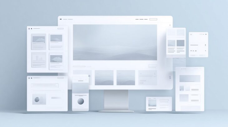
Today, we will discuss eight UX and UI frameworks that define modern homepage layouts, shown in engagement.
1. AI-Driven Personalization Framework
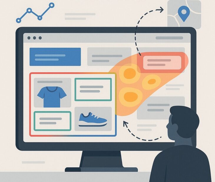
Artificial intelligence has reshaped the philosophy of homepage design, moving away from static layouts and toward adaptive canvases that evolve with each interaction.
Visitors no longer see the same homepage as everyone else; instead, their browsing history, preferences, and even location can influence what appears in front of them.
Predictive navigation menus, real-time layout adjustments, and tailored content blocks are no longer futuristic ideas but essential components of this framework.
At its core, AI-driven personalization works by collecting behavioral signals such as clicks, time spent on sections, and past navigation patterns.
Machine learning algorithms then process this data to reorganize layouts in ways that feel natural for each visitor.
For instance, a frequent shopper might see product recommendations front and center, while a new visitor could be presented with guided navigation or onboarding content.
Impact on Engagement
Personalization dramatically improves relevance, which is the foundation of digital retention.
Instead of overwhelming users with generic material, the homepage proactively surfaces what matters most to them.
Adaptive design strategies extend session duration, drive repeat visits, and strengthen trust in the brand’s ability to deliver value.
Pairing such frameworks with modern creative tools, such as an AI image generator free, ensures that even visuals evolve with user expectations.
2. Hyper-Minimalist UX Design System
Minimalism has shifted from being a stylistic preference to a functional strategy for modern homepage layouts.
Clean typography, thoughtful white space, and restrained use of color create a balanced environment that emphasizes clarity.
Micro-interactions, tiny visual cues such as hover highlights or button ripples, replace flashy animations, ensuring that every design decision has a purpose.
This design system thrives on the principle that less clutter equals more attention on meaningful content.
Instead of competing visuals, users encounter a streamlined path toward actions like reading a featured article, signing up for a service, or completing a purchase.
Key Features include:
- Extensive white space that highlights core elements
- Clean typography that conveys hierarchy without confusion
- Limited but purposeful use of color for emphasis
- Subtle micro-interactions that confirm user actions without overwhelming the experience
Why it Works for Users
Reducing cognitive load is one of the strongest benefits of hyper-minimalism.
Visitors process information faster and focus on calls to action without unnecessary effort.
Every scroll feels intentional, reinforcing the sense that the site is carefully crafted.
Minimalist frameworks also speed up load times, since fewer visual assets mean less data to process.
Brands adopting this approach often see improved user satisfaction and higher task completion rates, as users appreciate environments where clarity is valued over decoration.
3. Responsive Modular Grid Layout (Bento Grids)
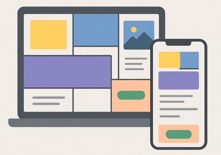
Homepage layouts no longer need to follow rigid, uniform structures.
Modular grid frameworks, especially the popular bento-style design, offer flexibility by organizing content into blocks that can be rearranged seamlessly across devices.
Unlike traditional symmetrical designs, bento grids introduce asymmetry and layering that create visual intrigue and encourage users to keep scrolling.
Adaptability is at the heart of this framework.
On desktop screens, content modules might appear in complex multi-column patterns, while on mobile devices, they automatically stack into single columns for easy viewing.
Designers gain the ability to experiment with arrangements without sacrificing usability, making this system as functional as it is visually engaging.
Core Features of Bento Grids:
- Flexible content blocks that shift naturally across devices
- Asymmetrical layouts that break monotony and hold attention
- Layered modules that highlight priority content without overshadowing other elements
- Easy scalability for future updates or new content types
How it Benefits Engagement
Varied layouts keep users interested by presenting fresh visual breaks as they scroll.
Asymmetry adds an element of curiosity, while modularity guarantees accessibility for all screen sizes.
Visitors are encouraged to interact with multiple sections since every block feels like an entry point into the site’s ecosystem.
The result is higher time-on-page, increased click-throughs, and stronger overall interaction.
4. Microinteraction-Enhanced UI Kit
Small design details often carry the heaviest weight in user experience.
Microinteractions are subtle animations and responses that acknowledge user actions:
- Hover states
- Button clicks
- Form submissions
Instead of leaving a user wondering if their action was registered, these enhancements provide instant feedback.
A loading animation that moves with the character, a checkmark appearing after a successful form submission, or even a gentle ripple effect on a button can transform an ordinary experience into one that feels responsive and alive.
Frameworks centered on microinteractions turn static designs into dynamic, engaging systems.
Every user action feels recognized, building trust and reinforcing usability.
Over time, this strengthens brand perception, since visitors remember experiences that feel polished and considerate.
Defining Features of Microinteraction Kits:
- Animated responses for clicks, taps, and hover effects
- Progress indicators and loading animations that keep users informed
- Visual confirmations such as checkmarks or color changes after completing actions
- Dynamic elements that humanize the interface and reduce friction
Why It Improves Retention
Recognizing small actions gives users confidence, which translates into repeated engagement.
When interfaces feel intuitive and responsive, frustration levels decrease, and satisfaction rises.
Users are more likely to stay, return, and recommend websites that acknowledge their input in meaningful ways.
Microinteraction-focused design not only supports usability but also creates emotional resonance, making every click feel worthwhile.
5. Accessibility-First Interface Framework
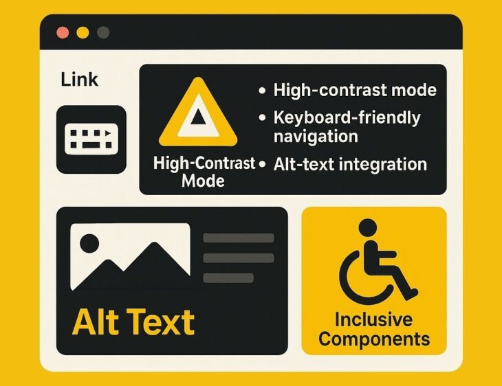
Accessibility-first frameworks ensure that websites are usable for everyone, including people with visual, auditory, or mobility challenges.
Designers who embrace accessibility build layouts with high-contrast color schemes, robust keyboard navigation, descriptive alt-text for images, and scalable typography.
This framework also aligns with legal and ethical standards, particularly those outlined in WCAG 2.1 AA guidelines.
Compliance avoids potential penalties but more importantly signals respect for users’ varied needs.
In many cases, accessible design also enhances SEO performance, as search engines reward websites that prioritize usability and clarity.
Key Accessibility Practices Built into Frameworks:
- High-contrast modes that improve visibility across conditions
- Keyboard-friendly navigation for visitors who cannot use a mouse
- Alt-text integration that assists screen readers and improves search indexing
- Inclusive components designed to adapt for different devices and abilities
How Accessibility Builds Loyalty
Inclusivity broadens audience reach and improves trust.
Users are more likely to return to websites where they feel acknowledged and supported, regardless of their personal challenges.
Accessible design conveys brand responsibility, turning visitors into advocates who value companies prioritizing equality.
Long-term, this approach strengthens both credibility and retention, proving that accessibility is not only ethical but also strategic.
6. Performance-First Mobile UX Architecture
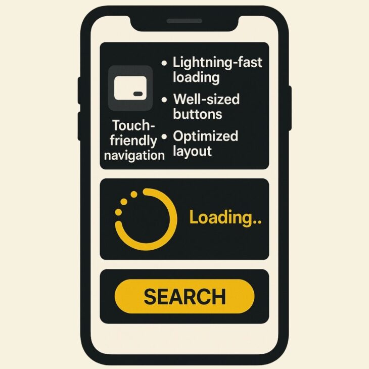
Mobile browsing has surpassed desktop in sheer volume, making performance on smaller devices a decisive factor in digital success.
Traditional “mobile-first” design once emphasized responsive layouts, but today’s expectation goes further.
A performance-first architecture ensures that mobile experiences are not just visually adapted but also lightning-fast, efficient, and reliable.
Performance-driven frameworks also pay attention to ergonomics.
Touch-friendly navigation, well-sized buttons, and layouts optimized for one-handed use make interaction effortless.
Instead of clunky pages that demand constant zooming or awkward scrolling, visitors encounter streamlined designs that feel natural on any screen size.
Mobile optimization becomes less about shrinking desktop features and more about building a frictionless environment for users who expect instant results.
Why Speed Dictates Success
Fast websites consistently outperform slower ones in engagement, conversion, and retention.
Users abandon pages that take even a few seconds too long to load, especially on mobile networks.
A performance-first approach reduces bounce rates, increases task completion, and builds trust by showing that user time is valued.
Efficiency does not replace aesthetics but enhances it, ensuring that design decisions never come at the expense of speed.
7. Visual Storytelling with Data-Centric Dashboards
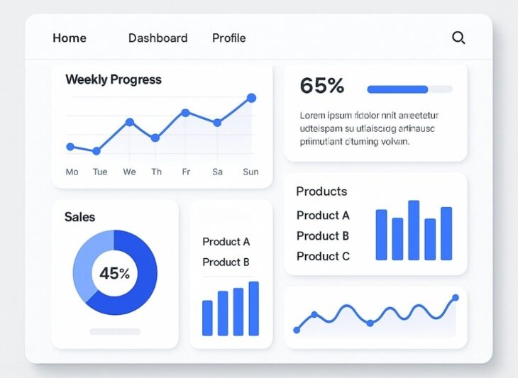
Data-centric dashboards allow brands to showcase performance, progress, or community insights in ways that feel engaging rather than overwhelming.
Instead of presenting visitors with raw numbers, designers now weave metrics into a narrative using charts, progress bars, and interactive visualizations.
The result is a homepage that informs while entertaining, encouraging users to spend more time engaging with data-driven elements.
Interactivity plays a central role in this framework. Users can click, filter, and hover over data points to uncover details that matter most to them.
For instance, a fitness app homepage might display a user’s weekly progress, while an e-commerce site could highlight trending products through live metrics.
Key Features in Data-Driven Storytelling:
- Interactive charts and graphs that invite exploration
- Real-time updates for metrics like KPIs, sales, or performance
- Narrative-driven layouts that explain data rather than just display it
- Personalized dashboards that reflect individual progress or activity
Why Storytelling Through Data Engages Users
Numbers alone rarely inspire, but when framed as a narrative, they become compelling.
Data-driven dashboards encourage repeat visits as users return to track changes and updates.
Engagement grows because the information feels alive, giving users a reason to stay longer and interact more deeply.
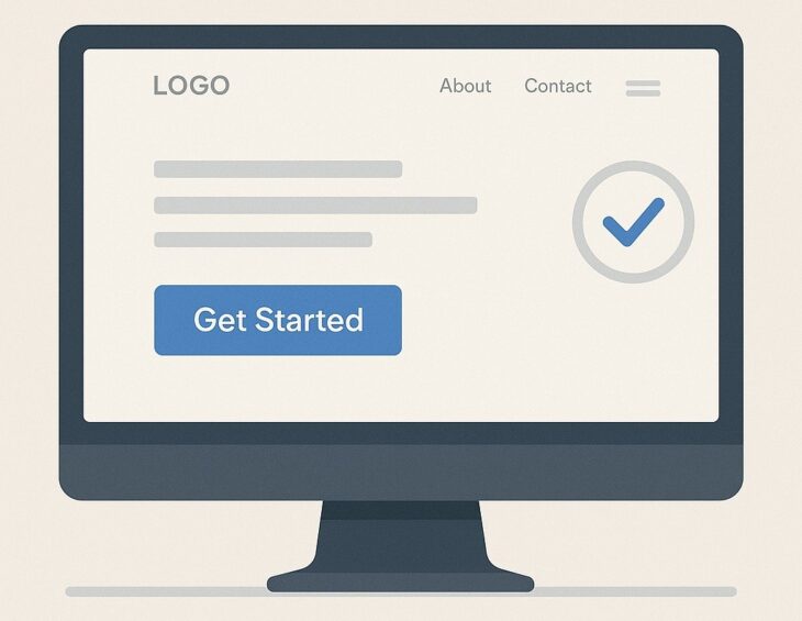
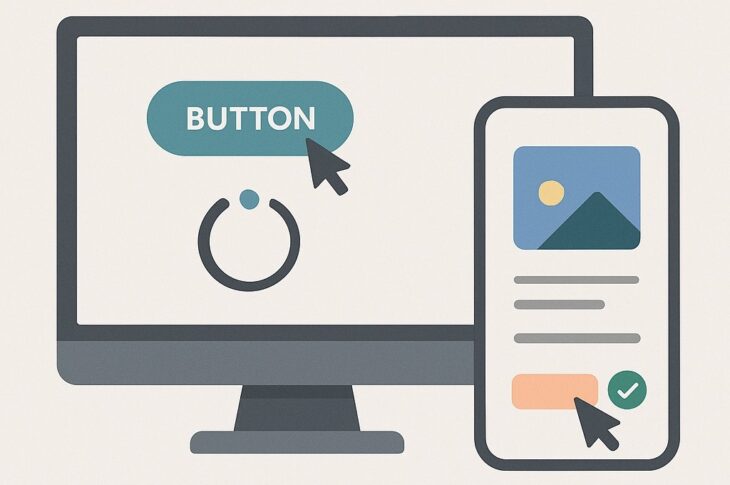
8. CTA-Centered Conversion Framework
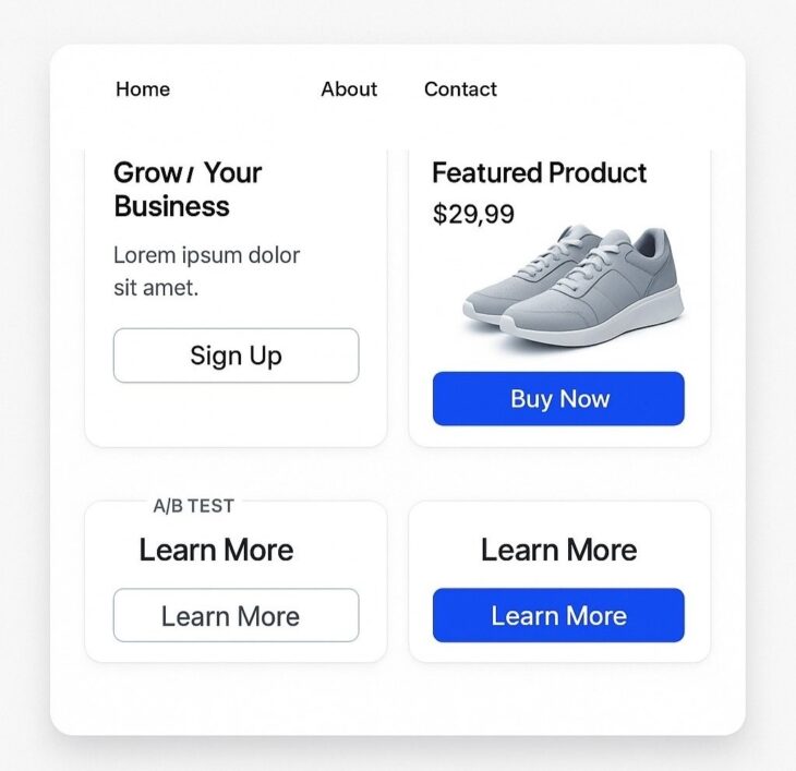
Conversions drive the ultimate success of most digital platforms, and homepage frameworks designed around calls-to-action (CTAs) place user decisions at the center of the experience.
Instead of hiding CTAs within dense text or scattering them randomly, this framework makes them impossible to miss without disrupting usability.
Subtle microanimations add liveliness, ensuring that CTAs feel engaging rather than intrusive.
Strategic testing lies at the core of this system.
Copywriting variations, button colors, and placement are frequently A/B tested to find the most effective combinations.
A homepage might position a primary CTA above the fold while supporting actions appear further down, guiding users through a funnel in carefully planned stages.
How CTAs Drive Measurable Outcomes
Effective CTAs reduce hesitation and streamline decision-making. Visitors are less likely to feel lost when their next step is clearly highlighted.
Clear and persuasive CTAs also reinforce brand confidence by making navigation effortless.
A framework centered on calls-to-action ensures that engagement flows naturally into measurable business results, proving that design decisions can directly influence growth.
Closing Comments
Modern homepage frameworks are more than stylistic choices, they are structured systems with measurable outcomes.
AI-driven personalization, minimalist clarity, data storytelling, and accessibility-first design are reshaping digital interaction into purposeful engagement.
Designers must select frameworks with the end-user’s goals in mind, ensuring that beauty never overshadows usability.